01 About Project
Rubic is a prominent decentralized finance platform, transforming cryptocurrency trading with innovative solutions for seamless transactions and global accessibility. It ensures security and reliability for users worldwide.
The platform remains at the forefront of DeFi innovation, offering decentralized financial opportunities for all.
The platform remains at the forefront of DeFi innovation, offering decentralized financial opportunities for all.
The project aimed to redesign and enhance the Rubic platform’s user interface and experience, focusing on improving usability and user satisfaction. Tasks included analyzing issues and devising solutions.
The work also involved creating a new design paradigm, updating the brand style, and providing localization for different languages and cultural nuances while maintaining unity of style and functionality.
The work also involved creating a new design paradigm, updating the brand style, and providing localization for different languages and cultural nuances while maintaining unity of style and functionality.
02 Main Goals and Project Tasks
The design concept of Rubic is based on the principles of minimalism, intuitive navigation, and modern style. The goal is to provide users with convenience in usage and a visually attractive platform.
The main focus is on clean design, ease of information perception, and high functionality to deliver an optimal user experience.
In developing the interface, I aimed to preserve its geekiness and practicality while integrating elements of strictness inspired by the banking sphere.
The main focus is on clean design, ease of information perception, and high functionality to deliver an optimal user experience.
In developing the interface, I aimed to preserve its geekiness and practicality while integrating elements of strictness inspired by the banking sphere.
03 Design Concept

04 Web Service
Rubic’s web service serves as a robust platform for decentralized finance (DeFi) enthusiasts, providing a user-friendly interface and seamless functionality for trading various cryptocurrencies and tokens.
With its emphasis on security, reliability, and intuitive design, Rubic offers users a convenient and efficient way to engage in DeFi activities.
With its emphasis on security, reliability, and intuitive design, Rubic offers users a convenient and efficient way to engage in DeFi activities.
Implementation
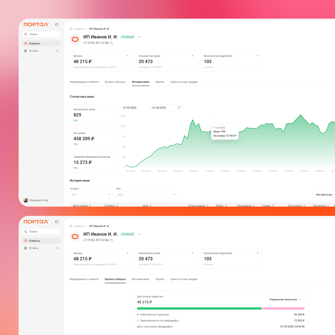
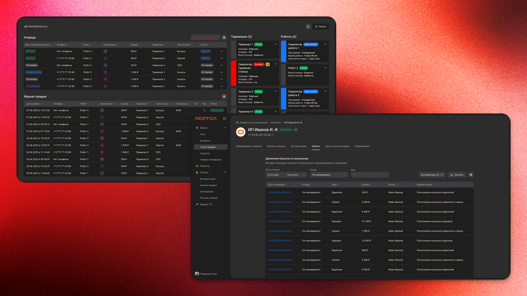
An analytical report was prepared indicating the bottlenecks and weaknesses of the service. When preparing the reports, a heuristic assessment was carried out, a map of user solutions was built, and usability testing was carried out. Based on the recommendations and received business requirements, a design system was developed, on the basis of which the service was redesigned. At the same time, new service functions were introduced, and minor problems that did not require long development, such as typography and color solutions, were corrected.
Tasks
Conducting a service audit, competitive analysis, collecting business requirements, putting forward hypotheses and proposals for improvement.
Role
Lead UI/UX


05 Colors Palettes
I enhanced the primary green hue for better visual appeal and engagement, aiming to create a more vibrant interface for Rubic while retaining its essence.
At the same time, it was very important to preserve the color palette for both light mode and dark mode:
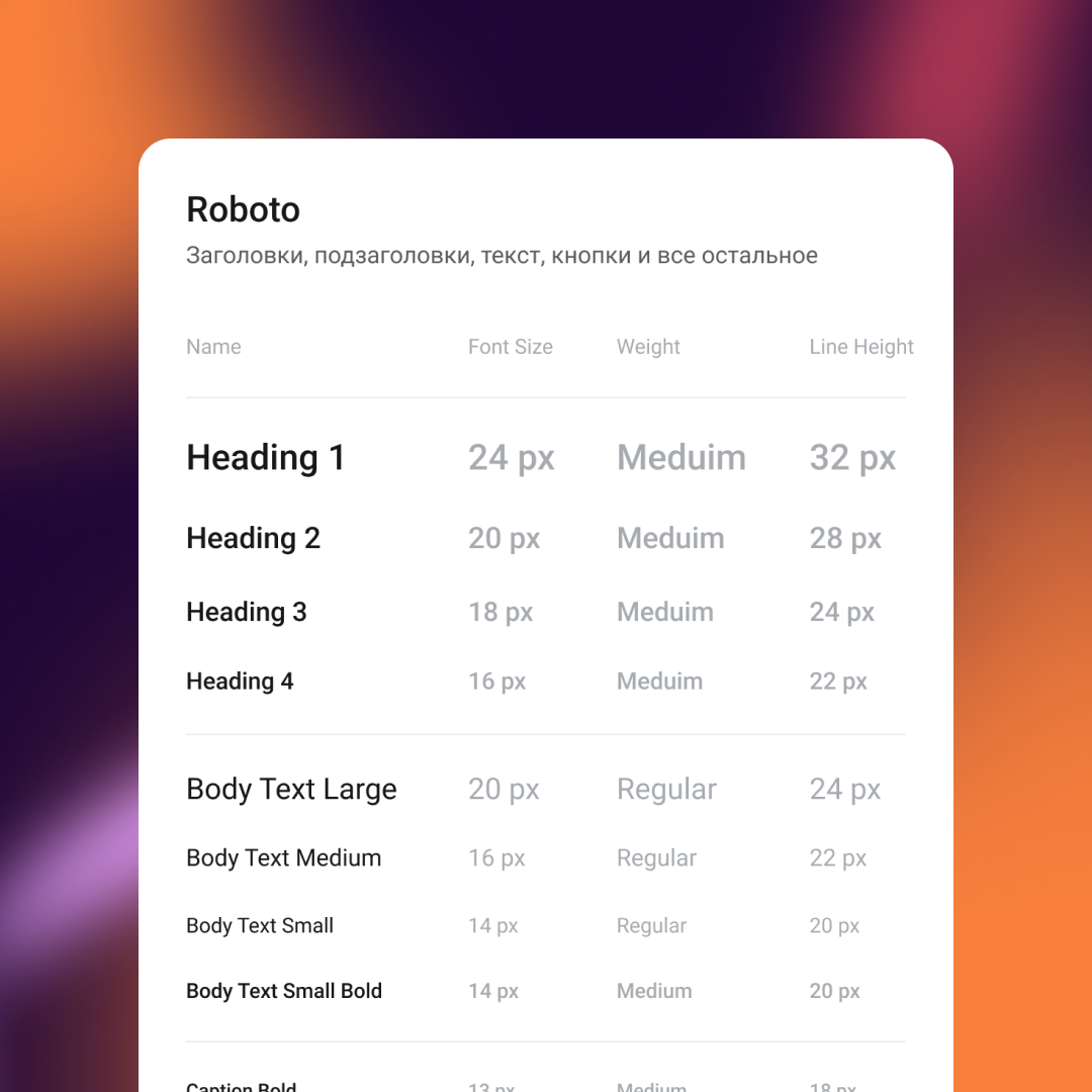
06 Typography
A new font was selected that was consonant with the name of the service, which gave even more confidence in the choice. I also developed font styles that will be used in the future.

07 Spacing System
It is noticeable that the gradation, built on a dynamic step, is clear and balanced. At the same time, the multiplicity of values is preserved.
The resulting gradation of sizes remains to be applied as a ready-made indentation system:
The resulting gradation of sizes remains to be applied as a ready-made indentation system:
When several items are in close proximity to each other, they become one visual unit rather than several separate units. Otherwise, their distance should be larger and look more like several visual units. The basic purpose of proximity is to organize. To give an apparent view of the page structure and the hierarchy of information to users.
Our first reference indent and step — 8px.
To build a correct system, the following gradation is used:
Our first reference indent and step — 8px.
To build a correct system, the following gradation is used:


08 Object Styles
Rules for elevations, borders, and blur were also developed.


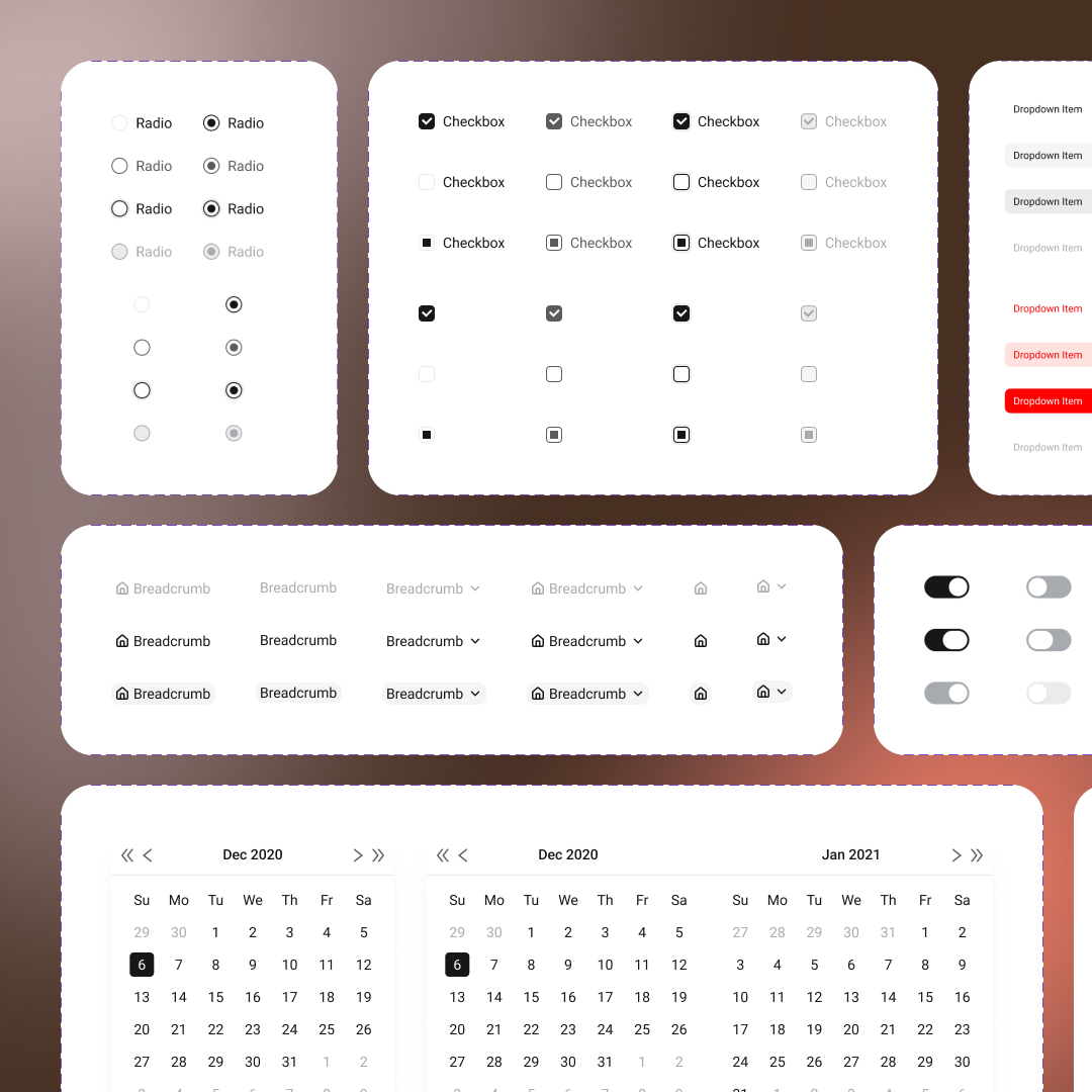
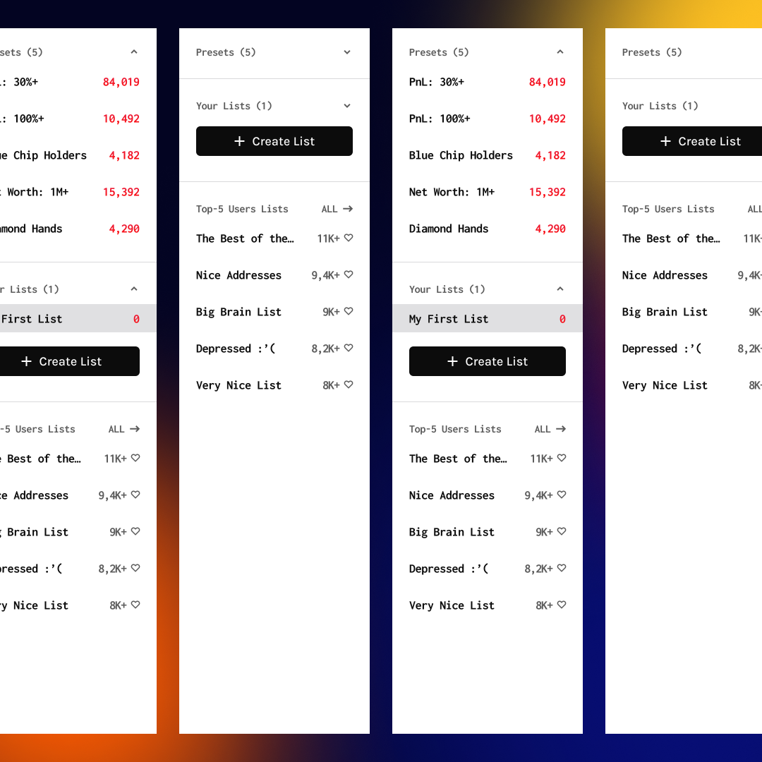
09 UI Kit
More than 2.000 assets were developed in two color modes.


10 Redesign
After the redesign, the application presents a cohesive and visually appealing interface. The refined color palette enhances readability and usability, while typography choices ensure a modern look. Users now experience streamlined navigation, making interactions intuitive and efficient.
Before the redesign, the application’s design lacked cohesion, with inconsistent color palettes and typography choices. Users often faced usability issues due to cluttered interfaces and unintuitive navigation, hindering their overall experience and engagement with the platform.


11 Multi-Chain
In the revamped multi-chain section, the design focuses on clarity and simplicity. The color scheme is tailored to differentiate between various chains, ensuring easy identification. Streamlined visuals and intuitive layouts facilitate seamless navigation and interaction, enhancing the overall user experience with improved accessibility and functionality.


12 Staking
In the updated staking section, the design prioritizes user engagement and transparency. Visual elements and intuitive interfaces guide users through the staking process, making it easy to understand and participate. With clear progress indicators and informative tooltips, users can confidently engage with staking features, fostering a sense of trust and empowerment within the platform.


More Works
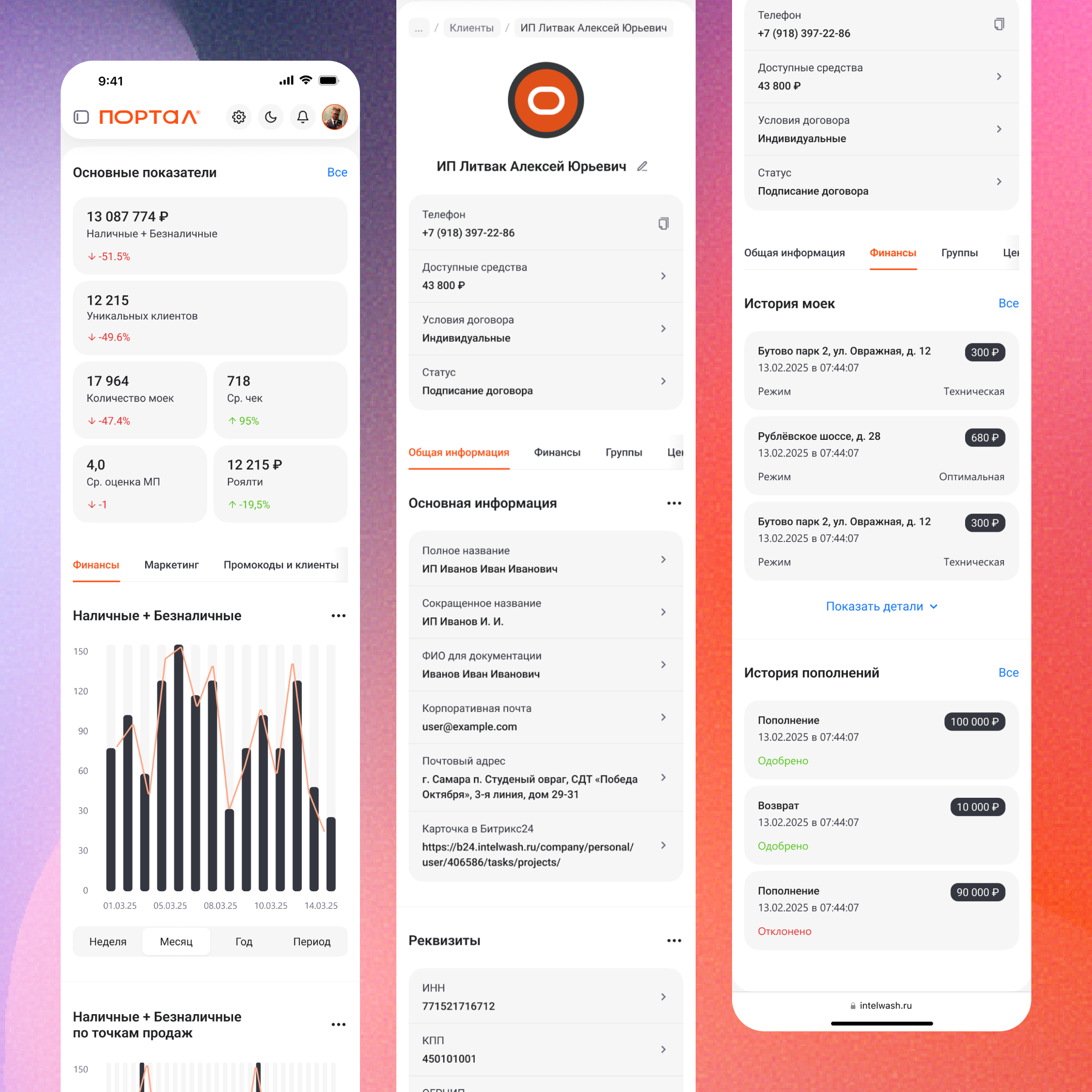
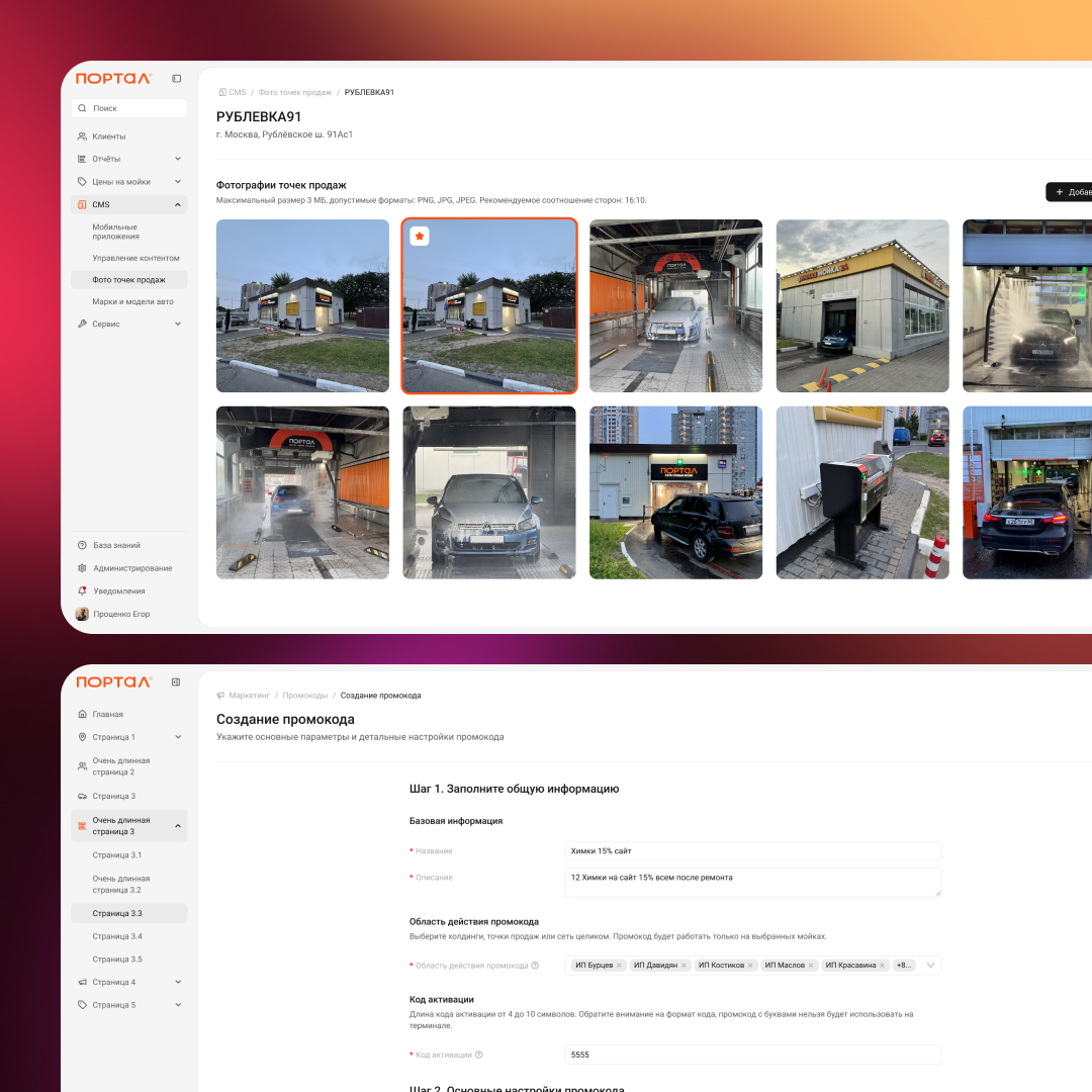
Back office for an automatic robotic car wash
Conducting a service audit, competitive analysis, collecting business requirements, putting forward hypotheses and proposals for improvement.
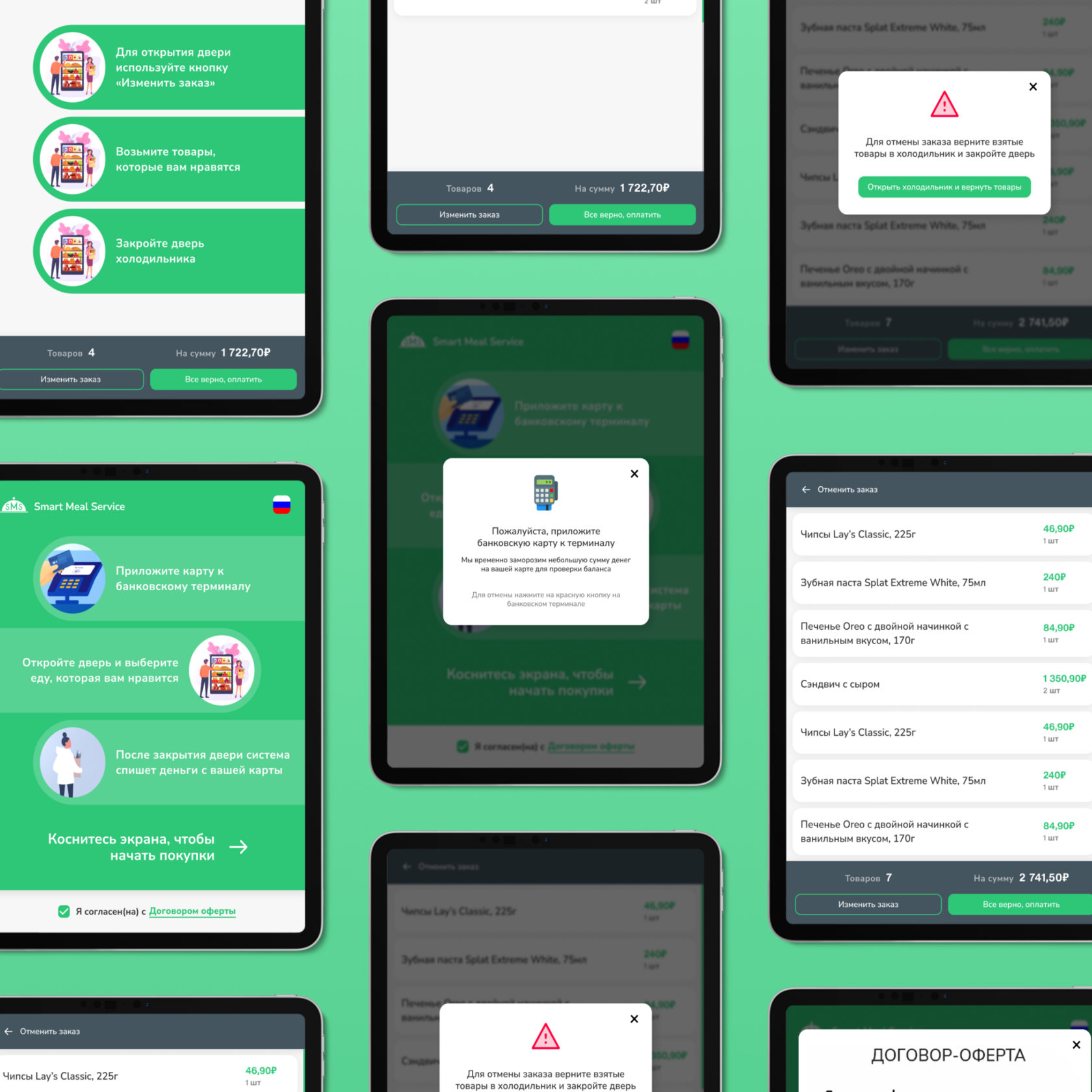

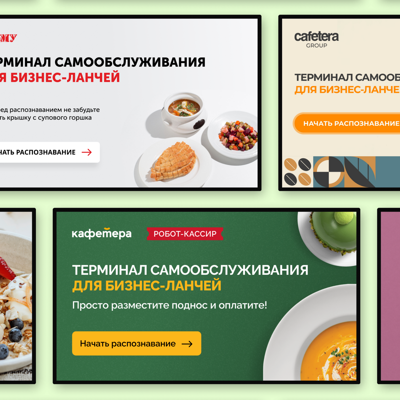

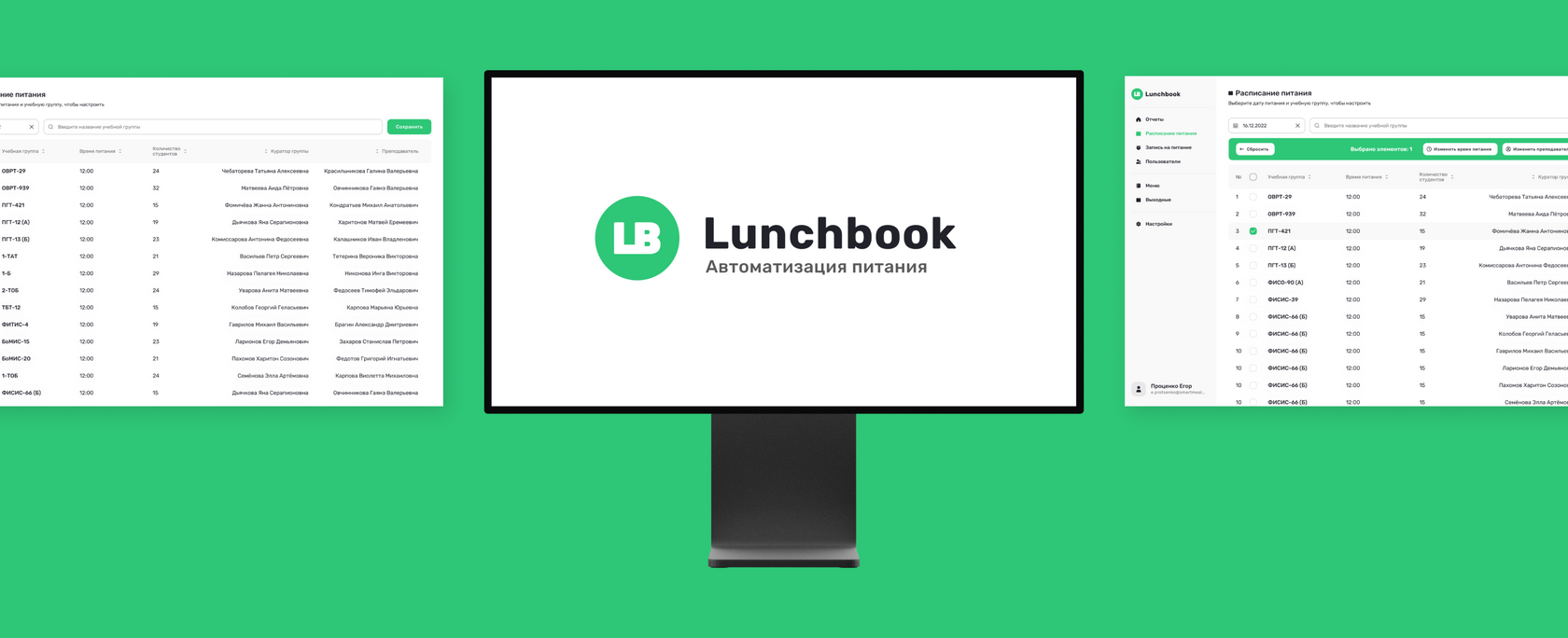
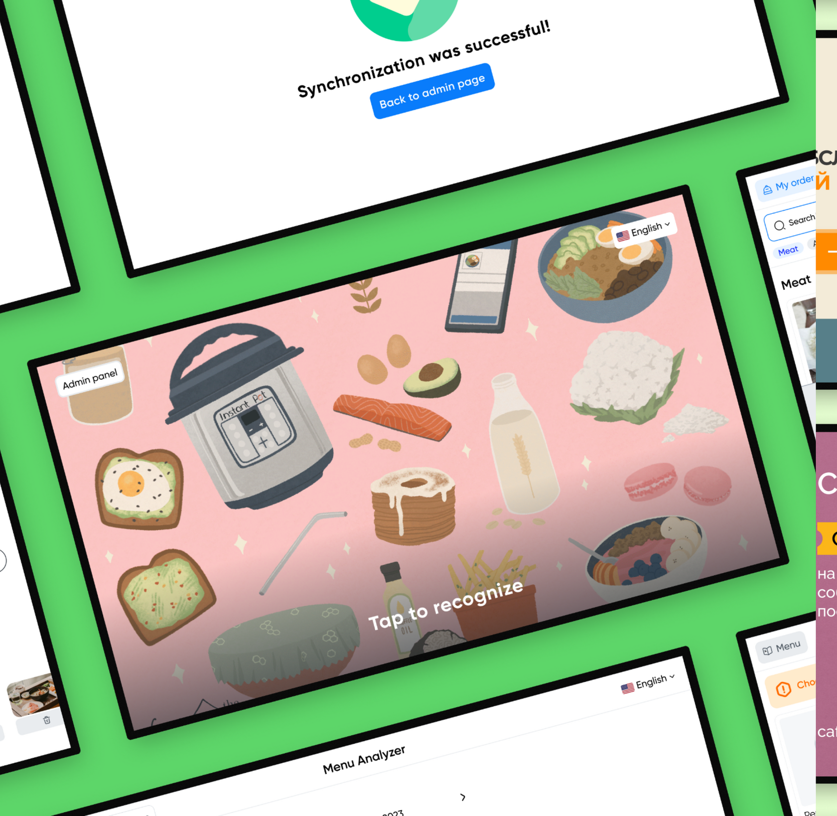
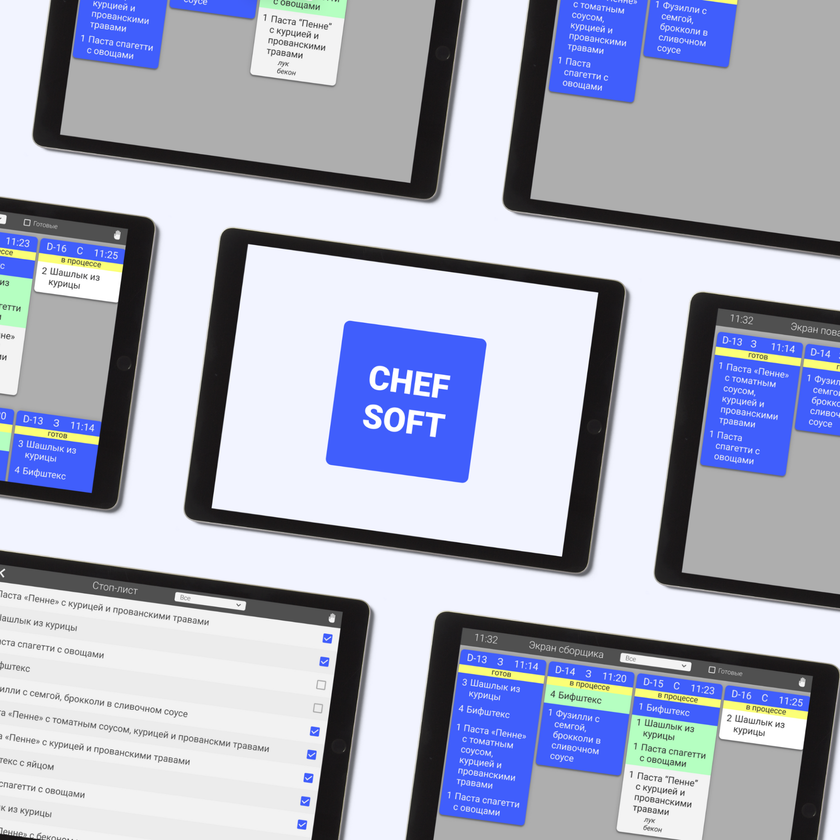
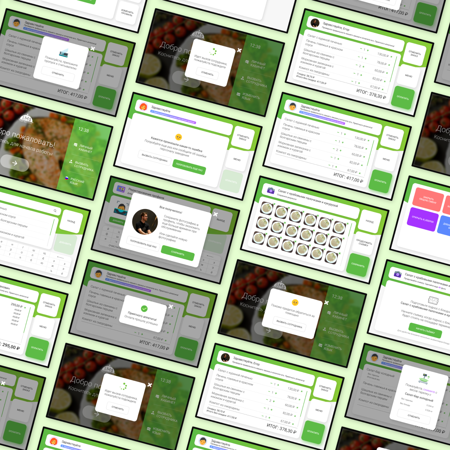
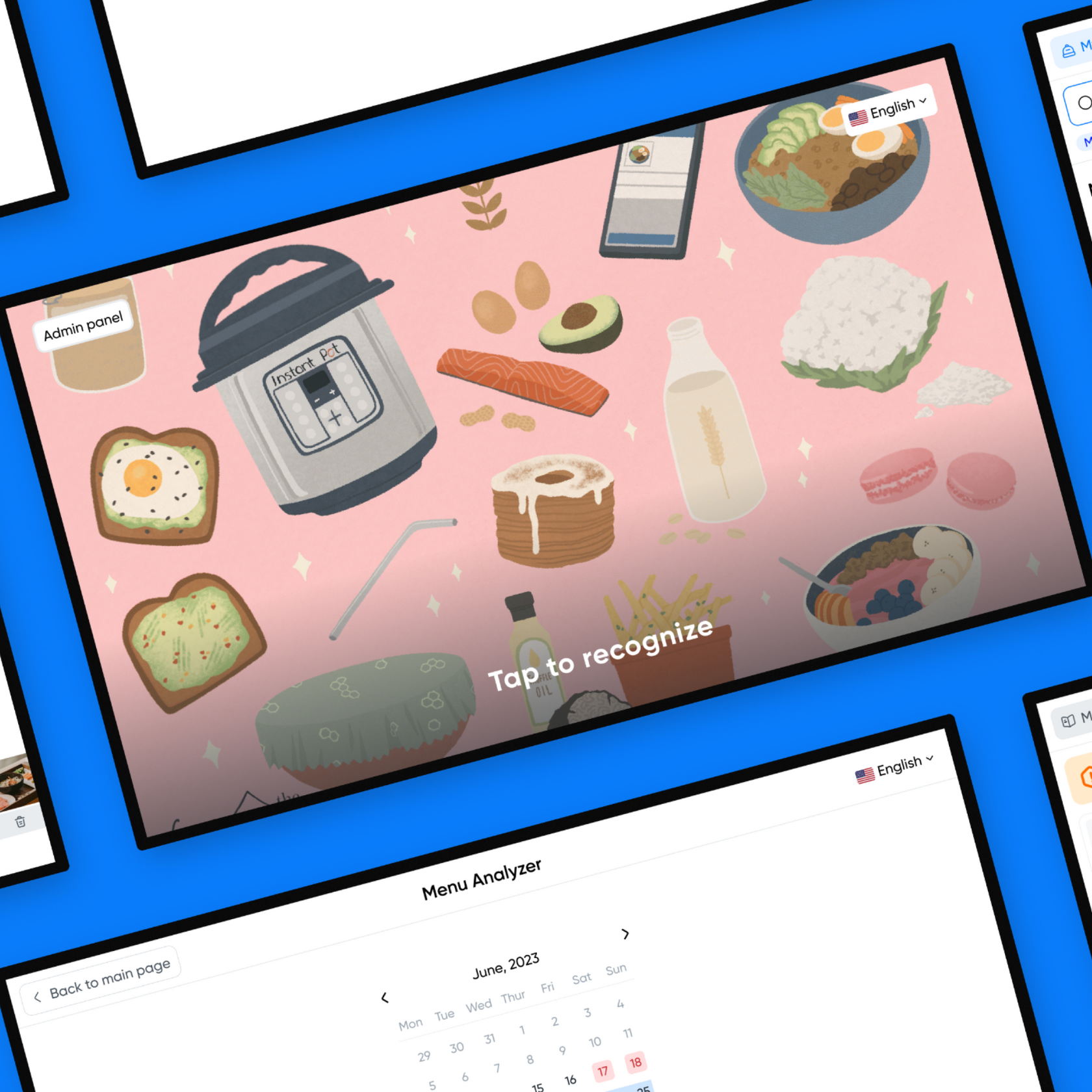
Digitalization of catering establishments
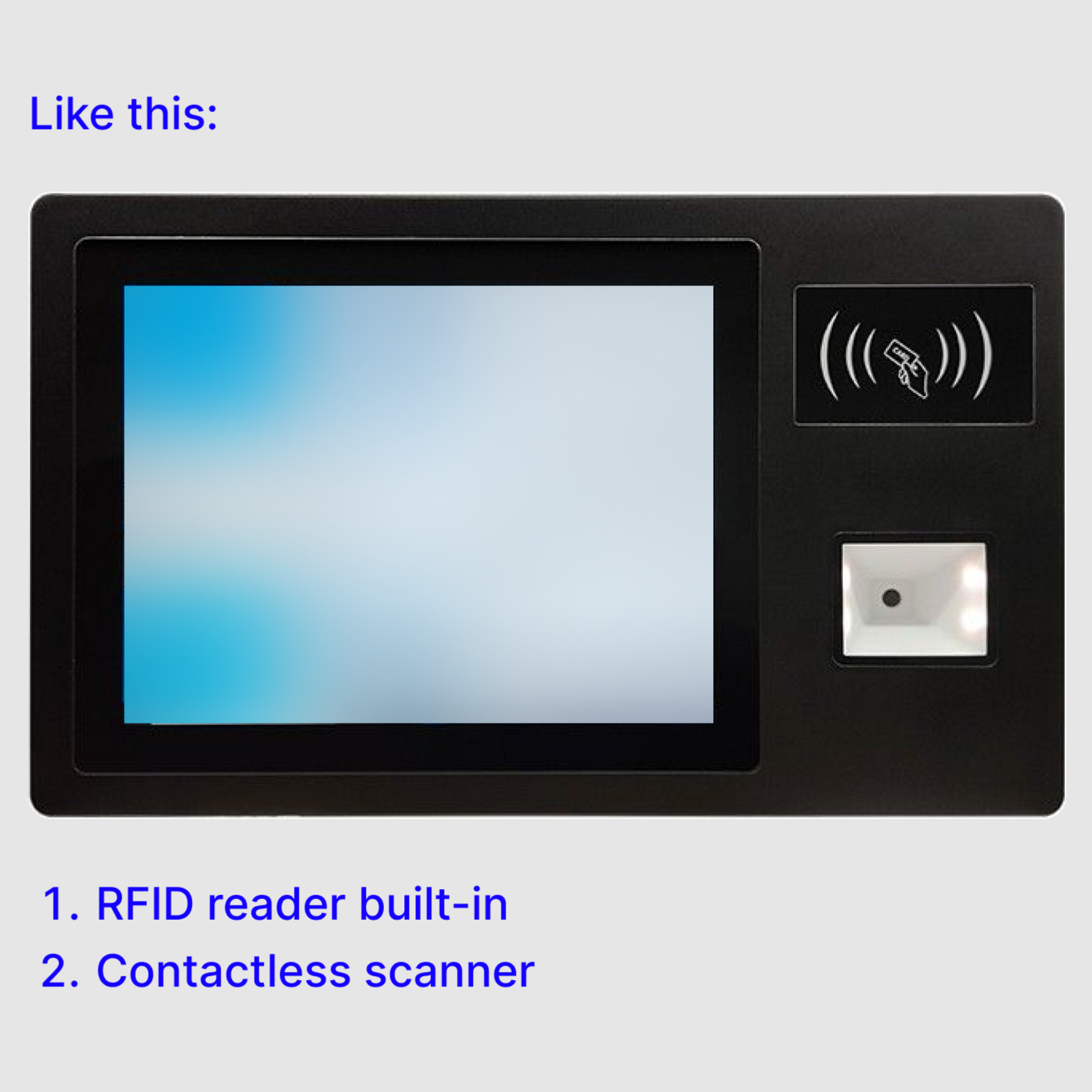
Creating a convenient and intuitively understandable interface for customers to optimize the self-service process. Reducing customer wait times through efficient and swift service. Additionally, integrating with payment and accounting POS systems to ensure seamless interaction with the system.
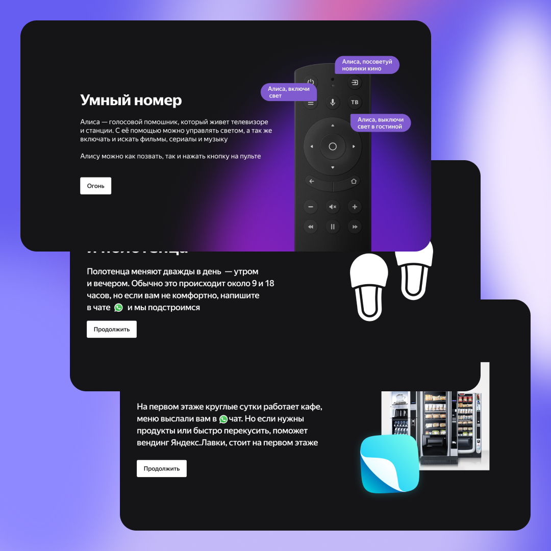
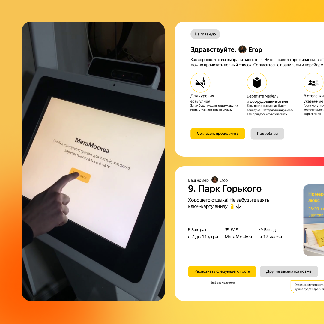
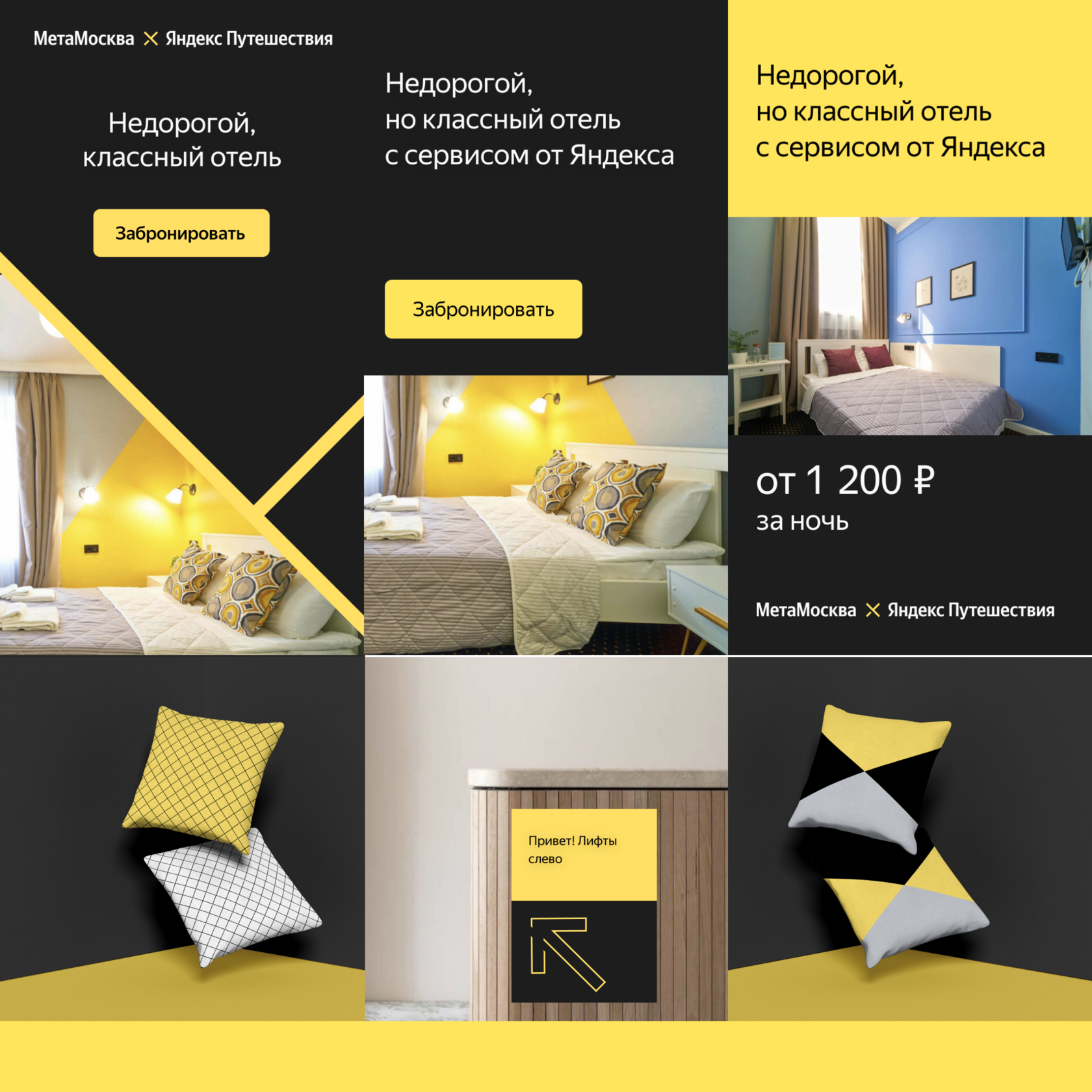
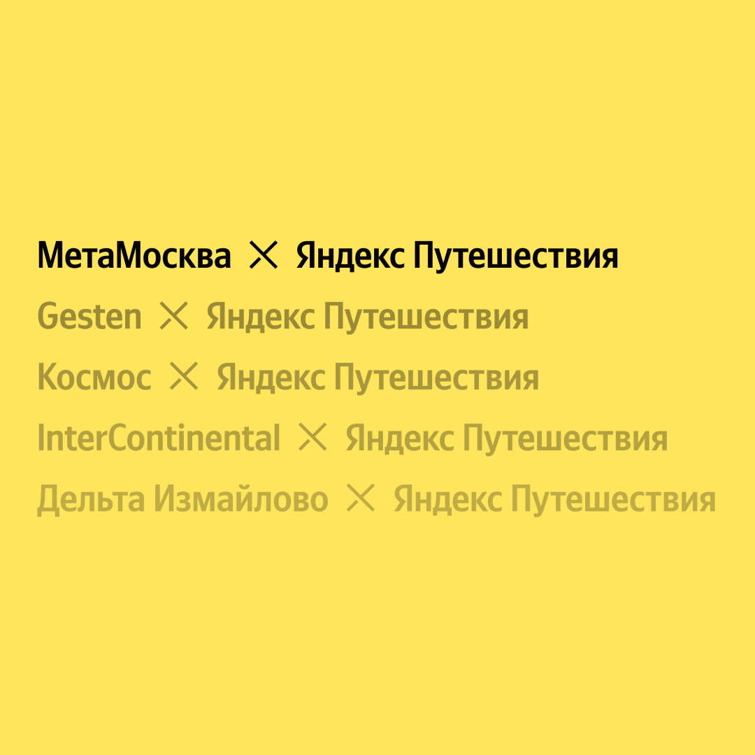
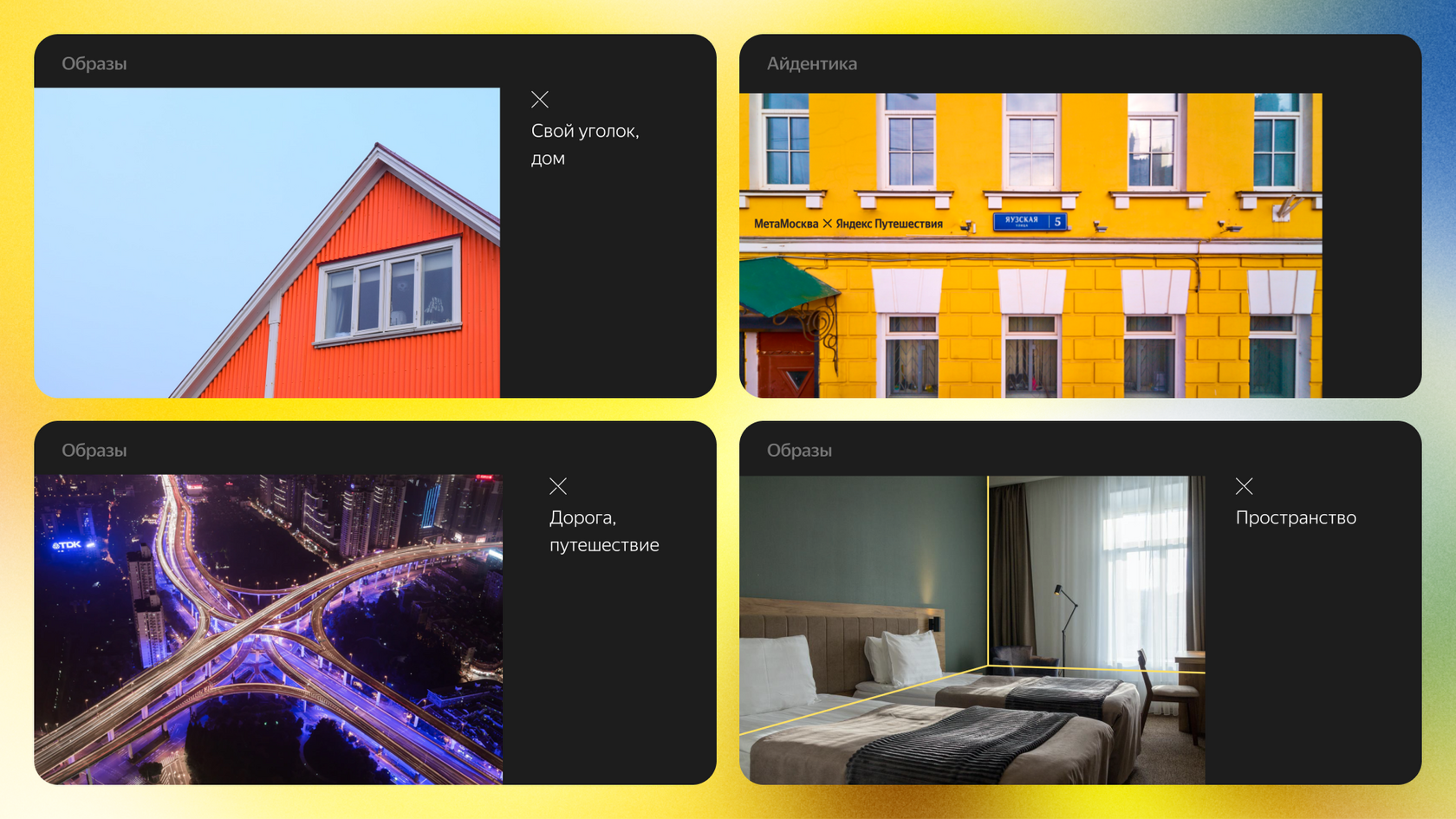
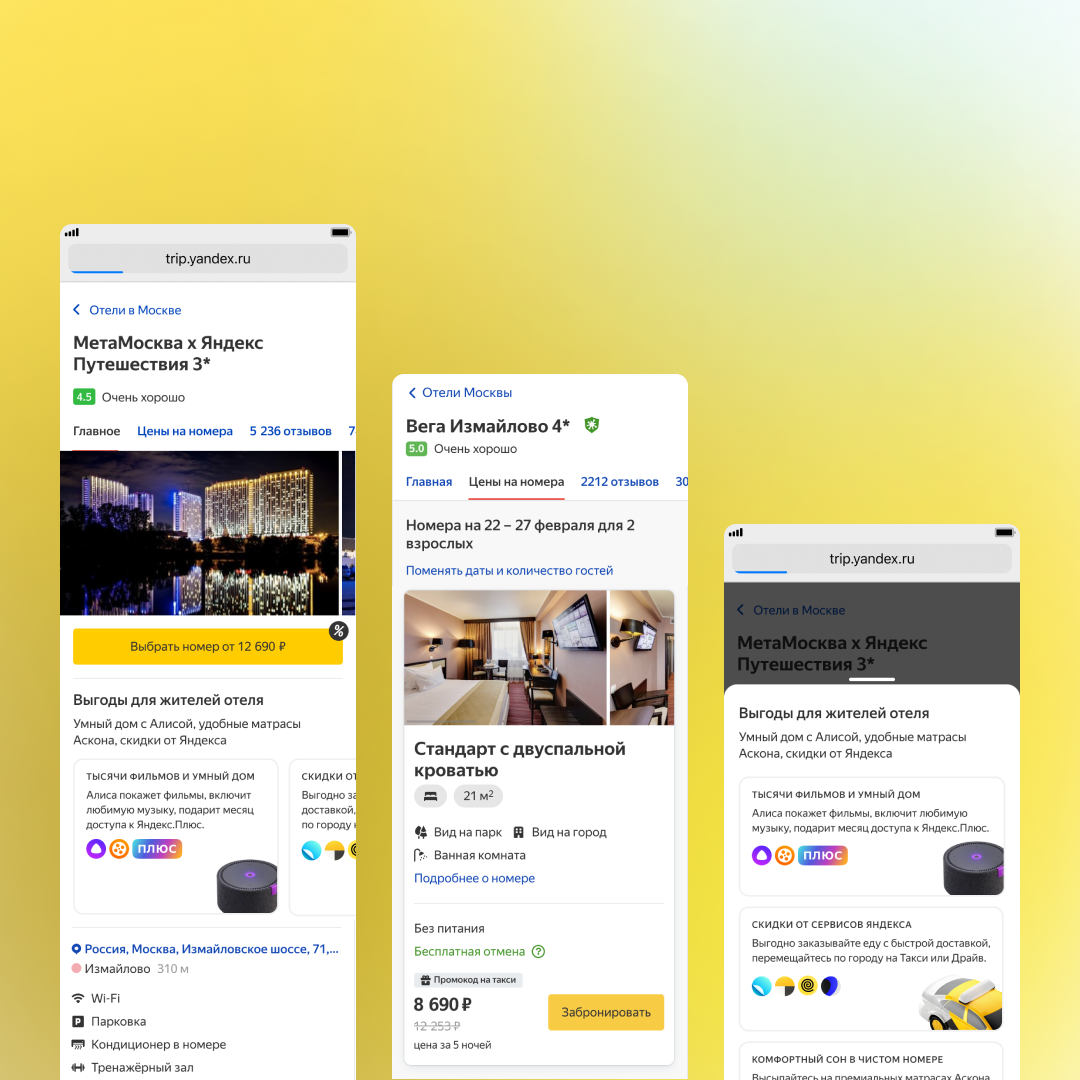
Advanced technologies in the hospitality industry
Development of the concept, workflow and interface of a self-check-in kiosk for the MetaMoscow hotel, as well as consulting the Yandex team on AI issues, plus create of promo materials.
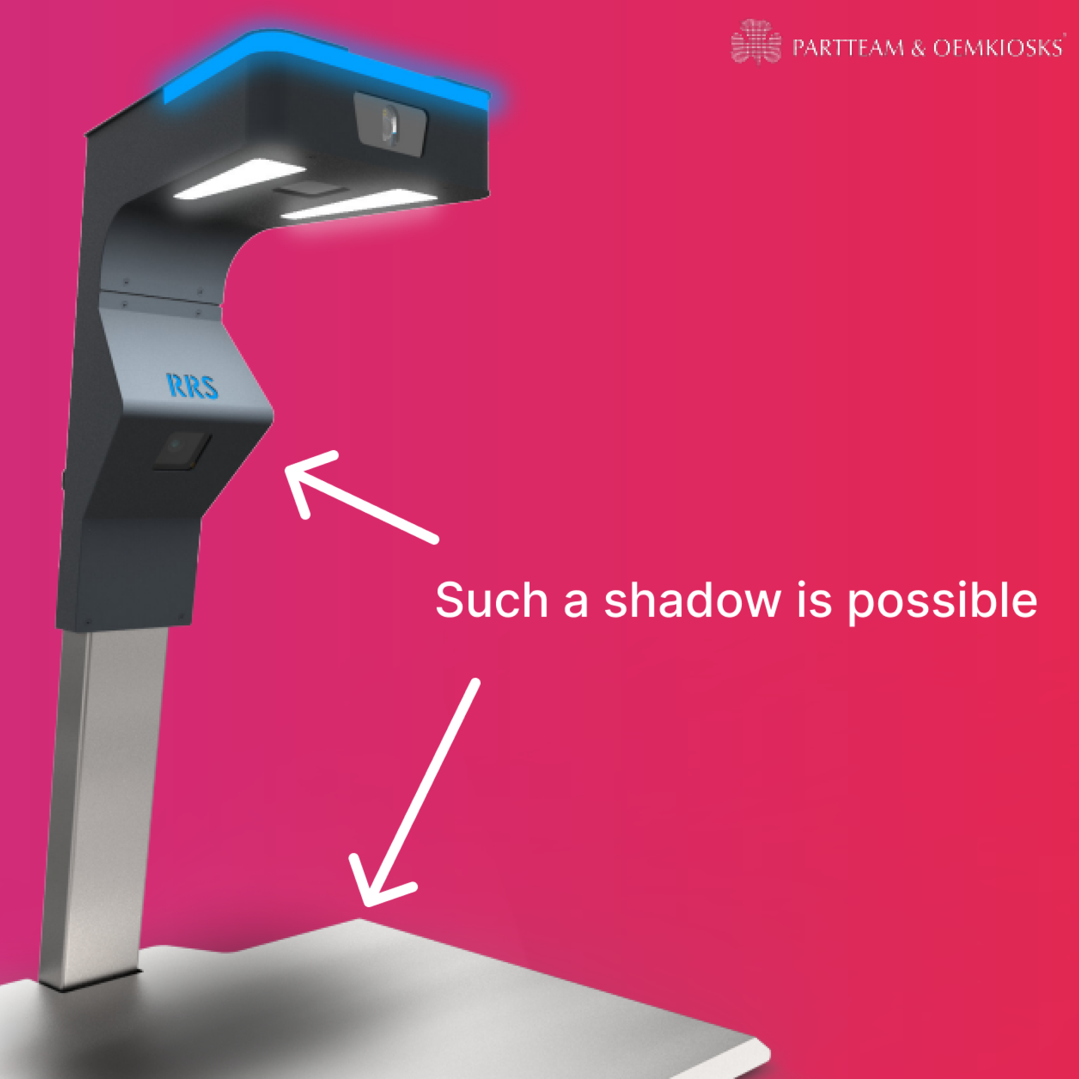
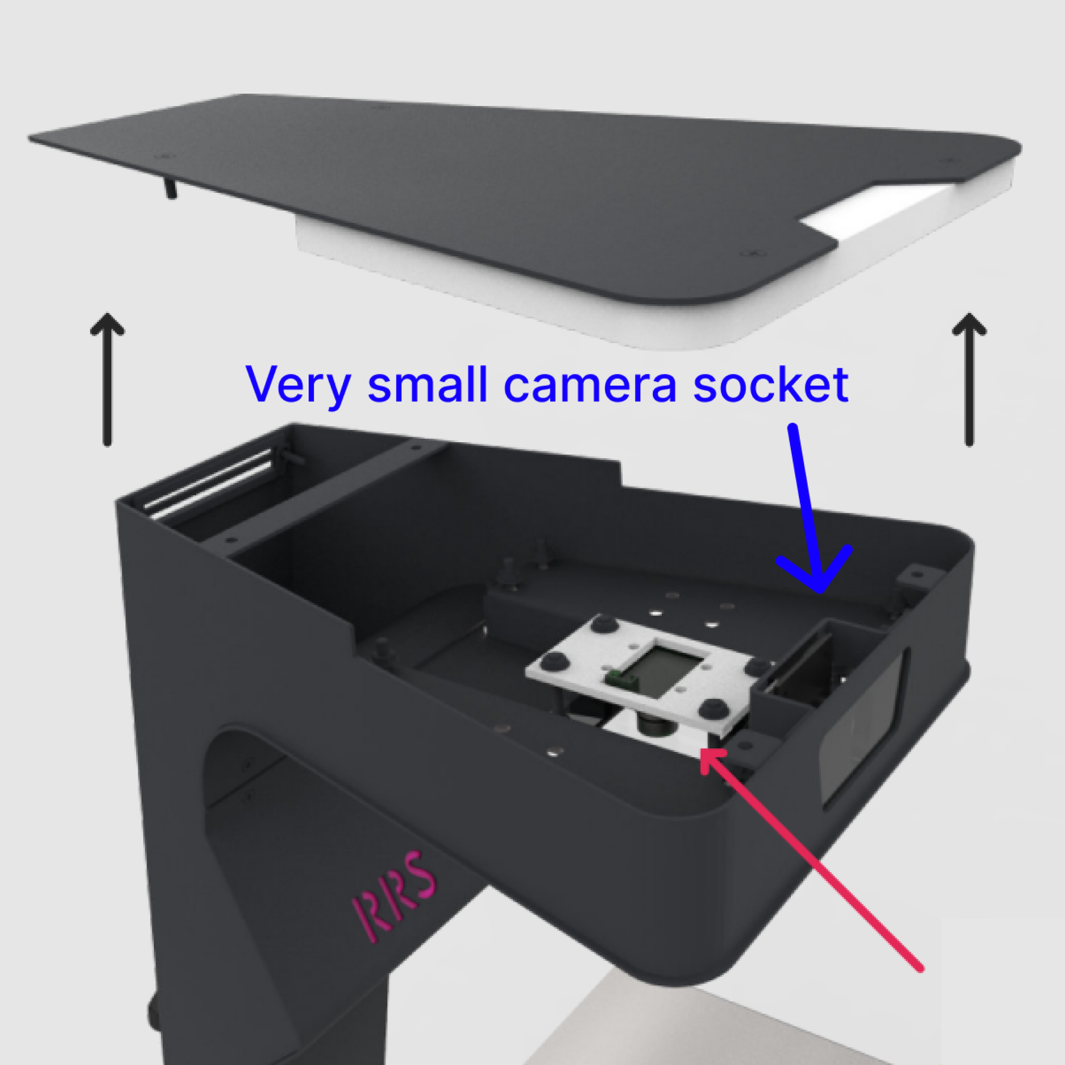
Fast Self-Checkout with AI and CV
My goal was to ensure high quality and efficiency in the device's design for optimal user experience and customer satisfaction.
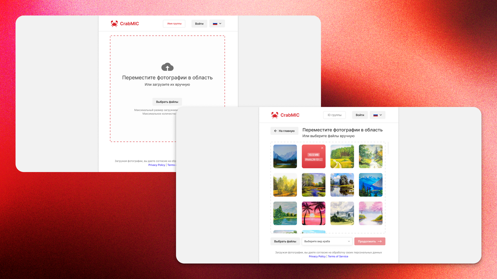
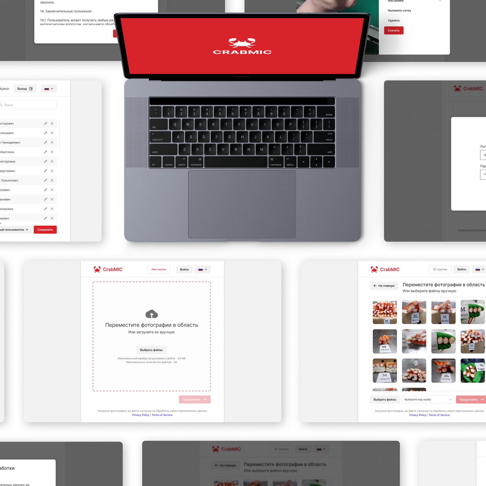
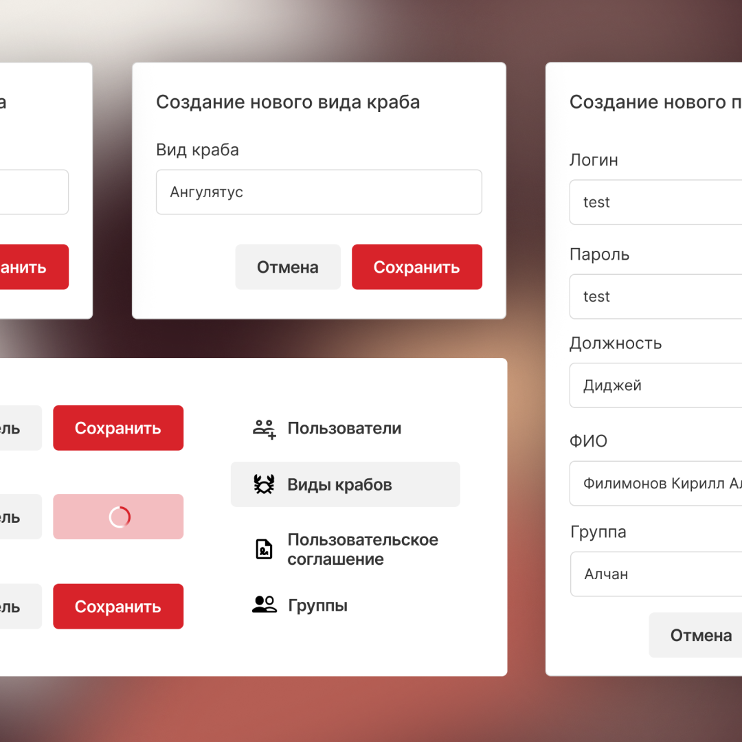
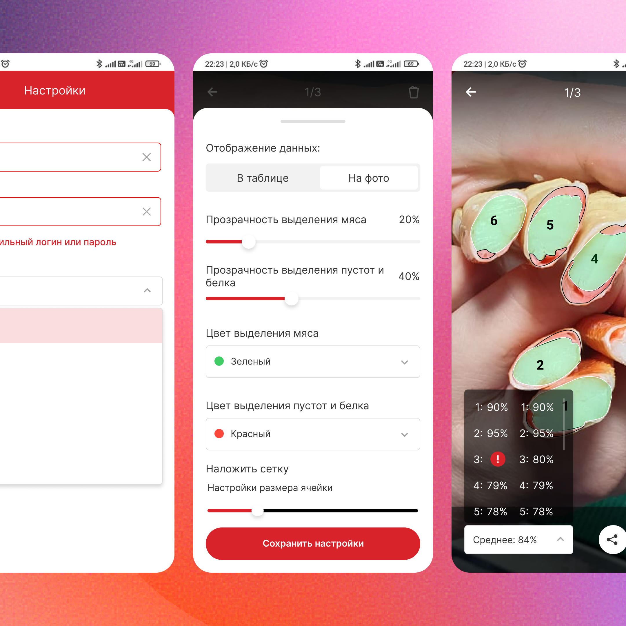
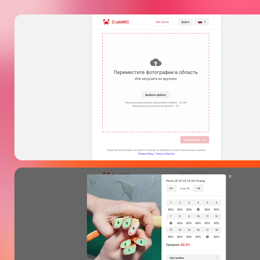
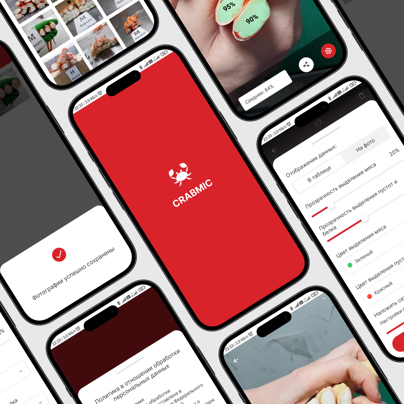
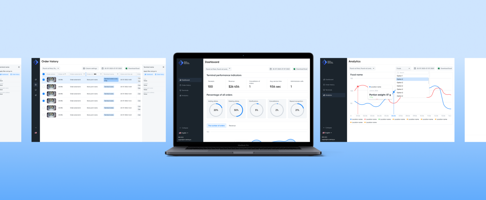
Web service and app for assessing the quality of crabs
Silver medal Tagline Awards-2023
Bronze medal CrossConf Awards 2024
Finalist Workspace Digital Awards 2024
Gold medal AI in Action 2025
Collecting business requirements, developing a concept and users flow. Web interface and mobile application design. As well as developing a service development plan.
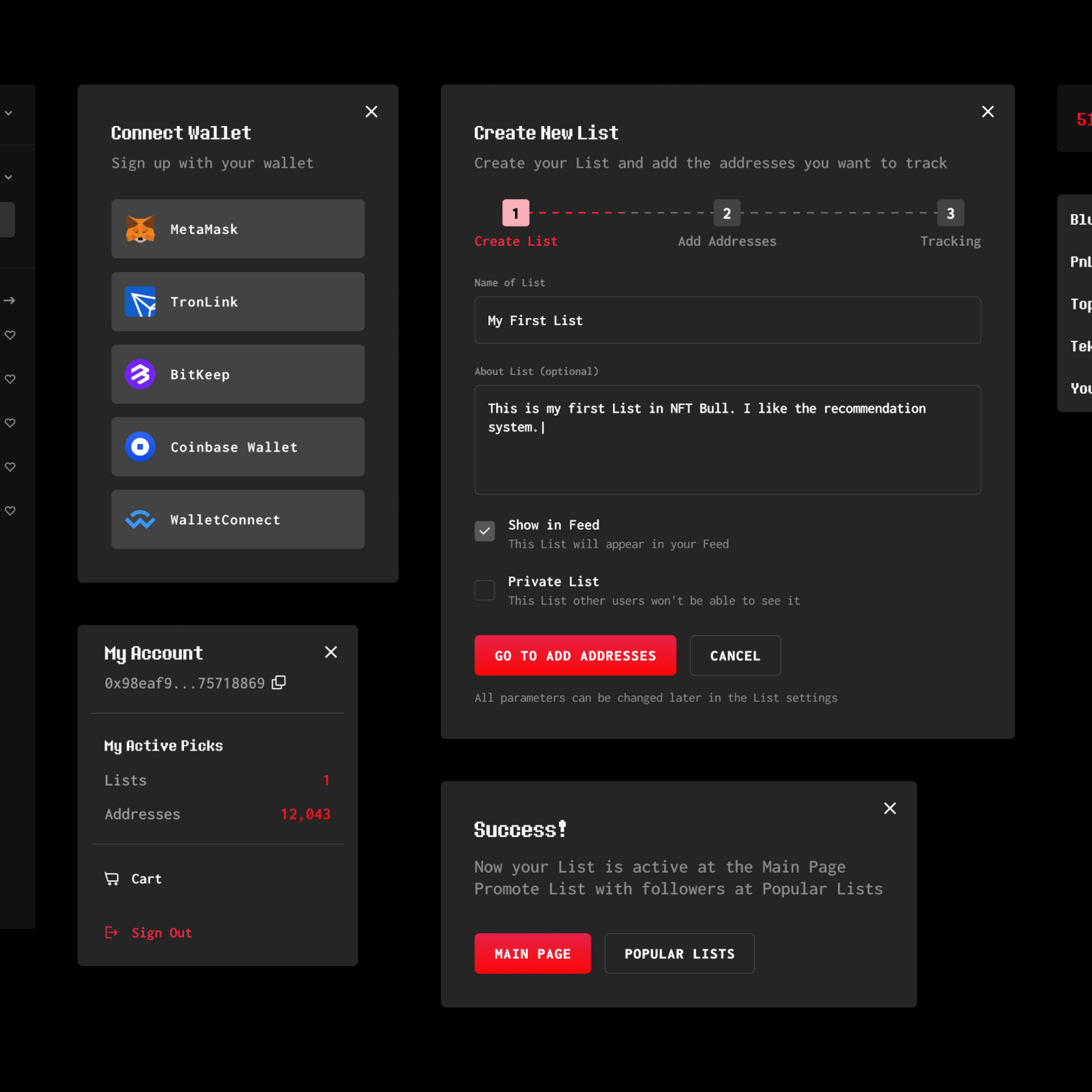
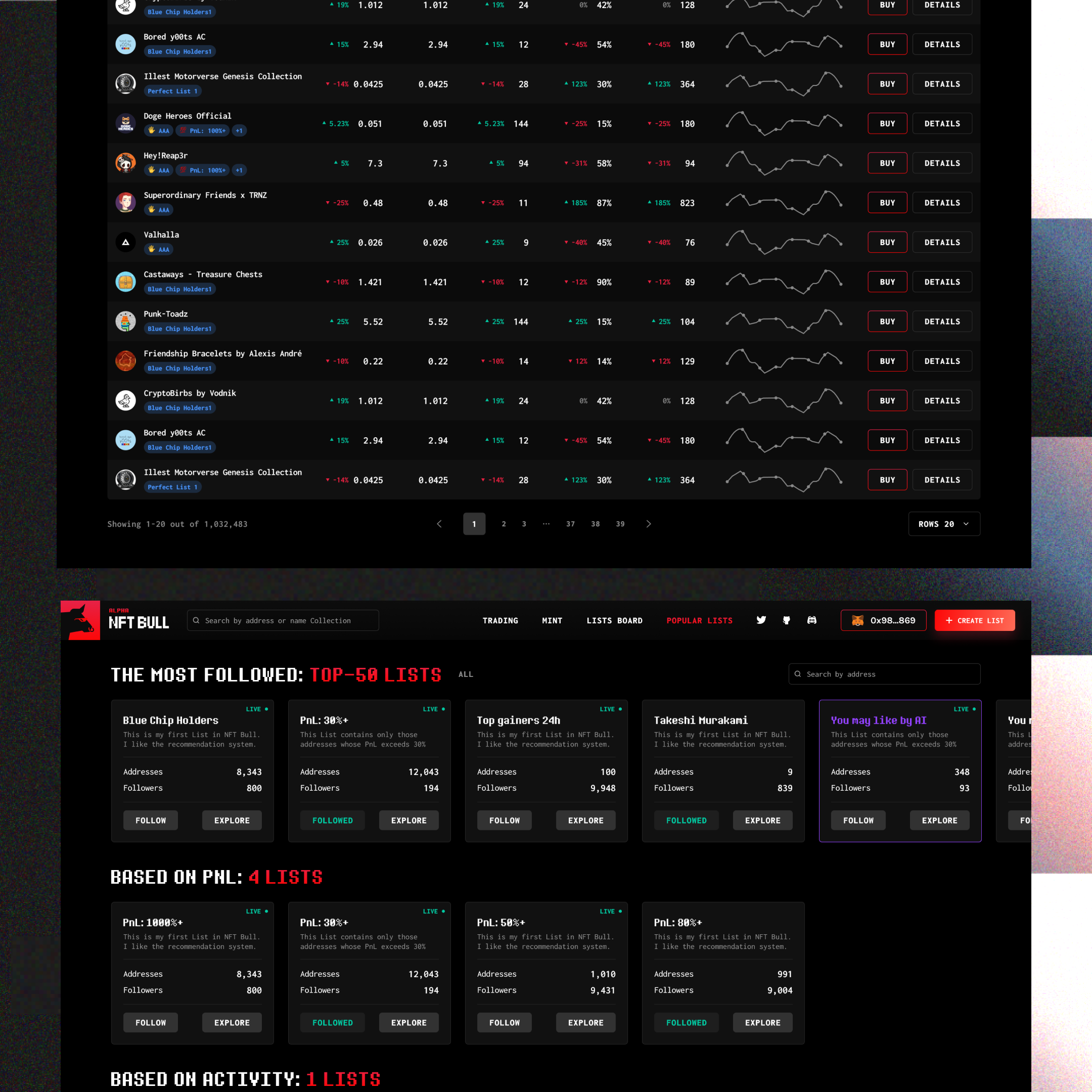
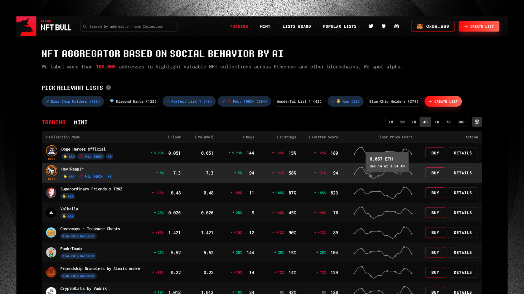

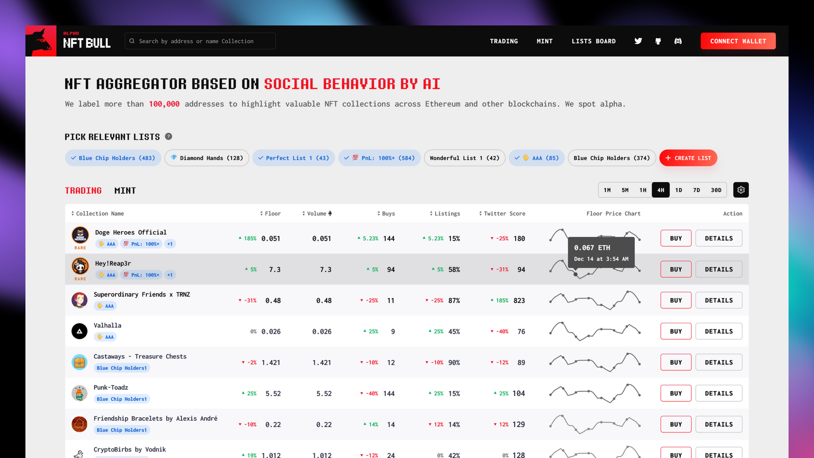
NFT Aggregator based on Social Behavior by AI
Development of the concept, workflow and interface of main functions, competitive analysis, collecting business requirements, and creating an MVP version of the service.
Contact me to explore the potential of your project.
CONTACT
WORKS


