
О проекте
Цели и задачи
Концепция
Веб-сервис
Палитра
Типографика
Система отступов
Стили объектов
UI-кит
Редизайн
Multi-Chain
Staking

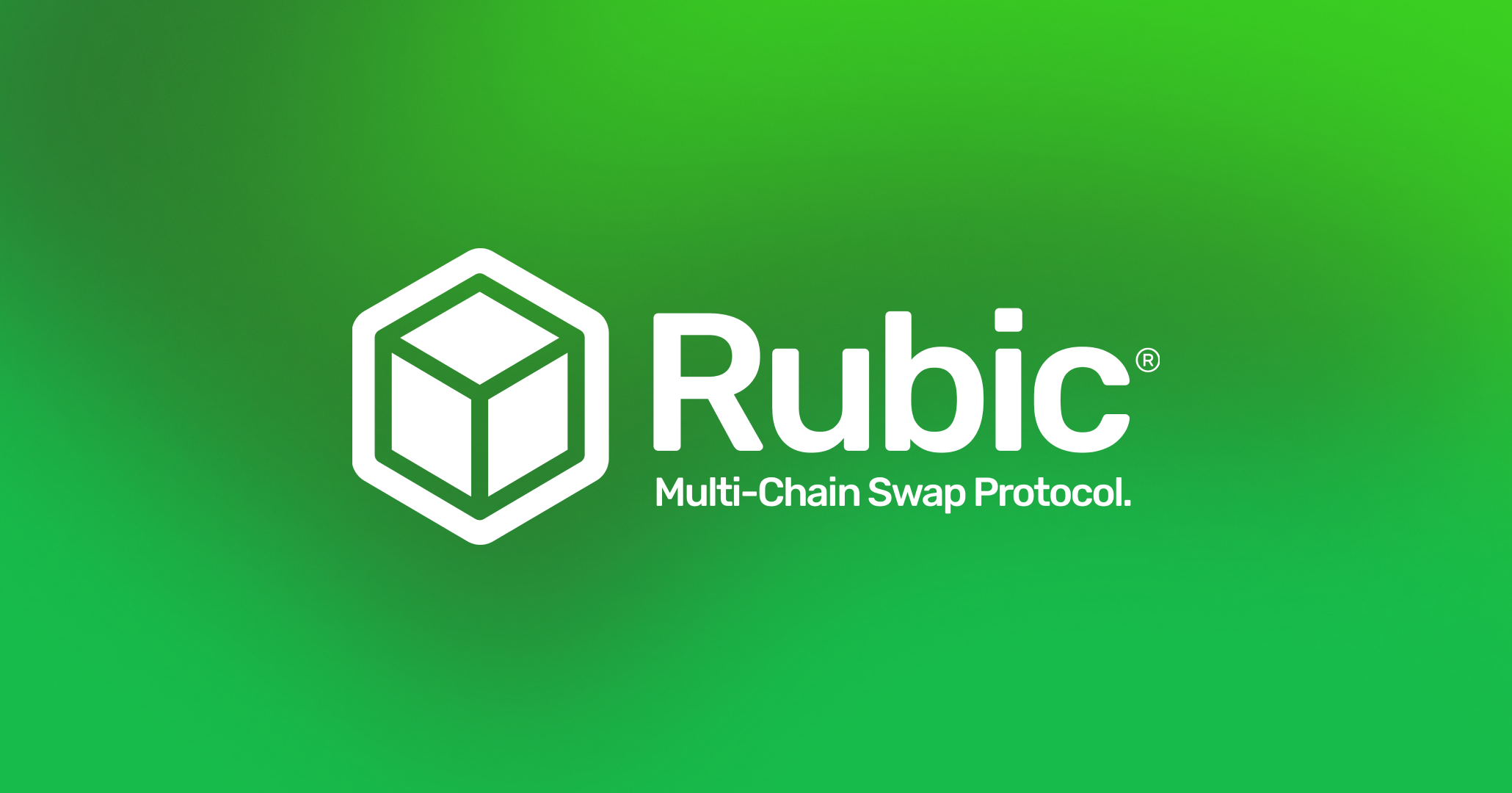
Rubic
2021 – 2023
О проекте
Rubic — это инновационная DeFi-платформа для безопасной и удобной торговли криптовалютой.
Она обеспечивает быстрые и бесшовные транзакции, оставаясь одним из лидеров DeFi.
Цели и задачи
Проект был направлен на редизайн и улучшение интерфейса Rubic: анализ проблем, разработку решений, создание новой дизайн-системы, обновление фирменного стиля и адаптацию платформы под разные языки и культуры при сохранении единого визуального и функционального подхода.
Концепция
Дизайн Rubic основан на минимализме, интуитивной навигации и современном стиле.
Он сочетает чистый, функциональный интерфейс с сохранённой «гиковостью» и аккуратной строгостью, чтобы обеспечить удобство, визуальную лёгкость и профессиональный характер платформы.
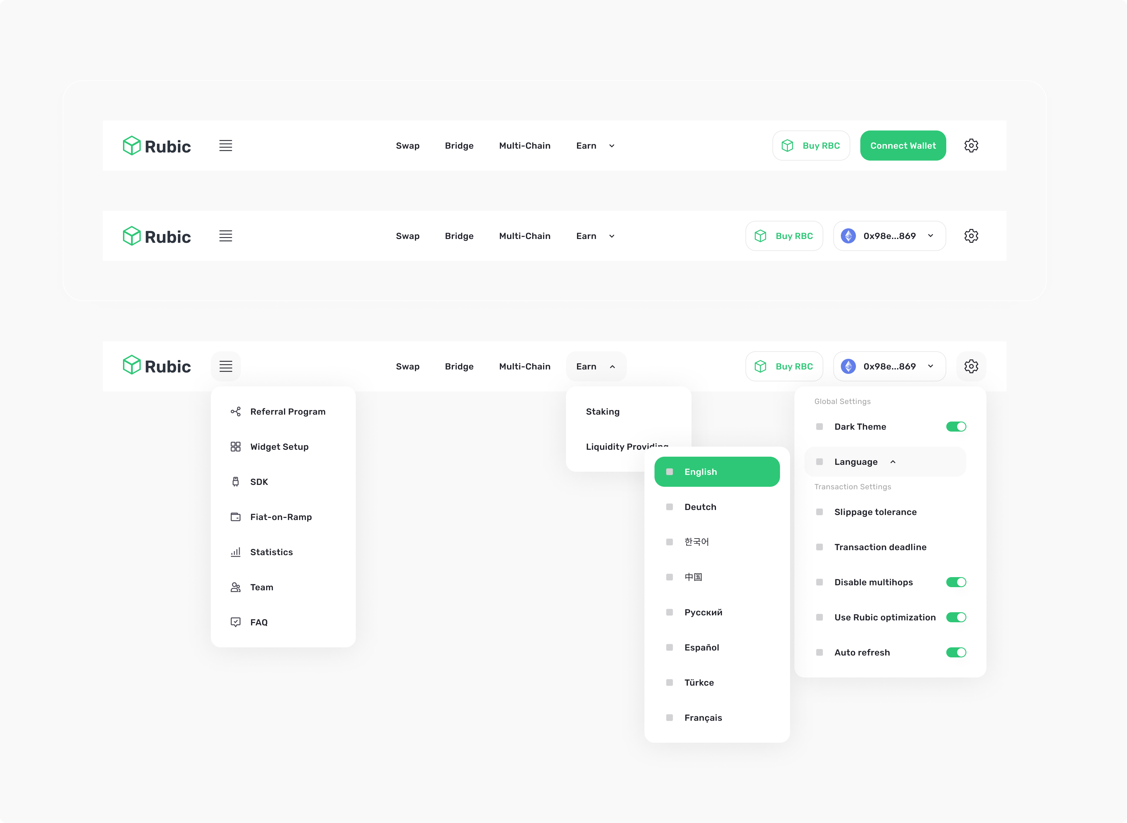
Веб-серивс
Дизайн Rubic основан на минимализме, интуитивной навигации и современном стиле.
Он сочетает чистый, функциональный интерфейс с сохранённой «гиковостью» и аккуратной строгостью, чтобы обеспечить удобство, визуальную лёгкость и профессиональный характер платформы.
Роль
Ведущий UI/UX дизайнер
Задачи
Аудит и конкурентный анализ, сбор бизнес-требований, формирование гипотез и предложений по улучшению
Реализация
Был подготовлен аналитический отчёт с выявленными проблемами сервиса: проведена эвристическая оценка, построена карта пользовательских сценариев и выполнено юзабилити-тестирование.
На основе выводов и бизнес-требований создана дизайн-система и выполнен редизайн, внедрены новые функции и исправлены мелкие UI-недочёты, включая типографику и цветовые решения.
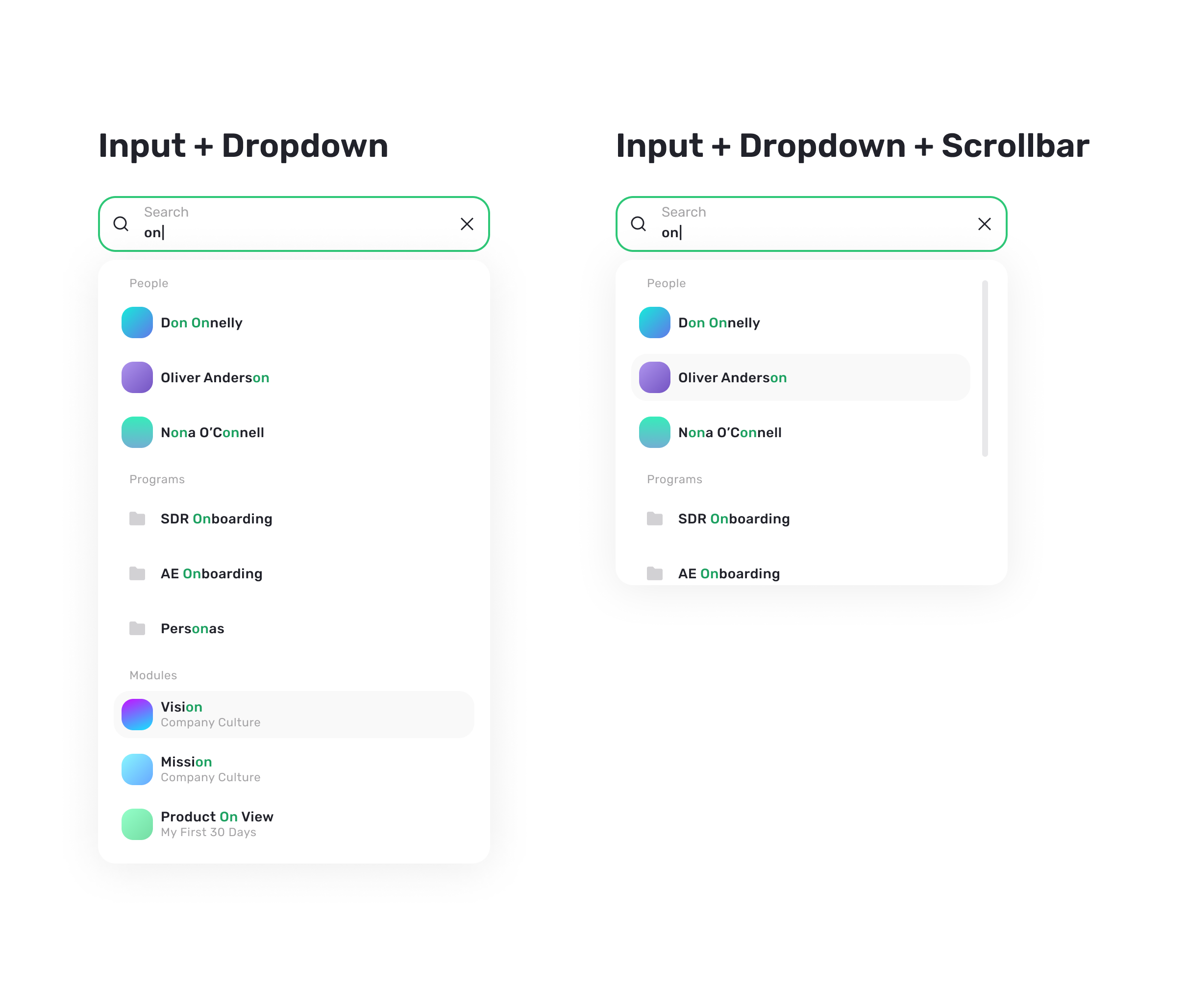
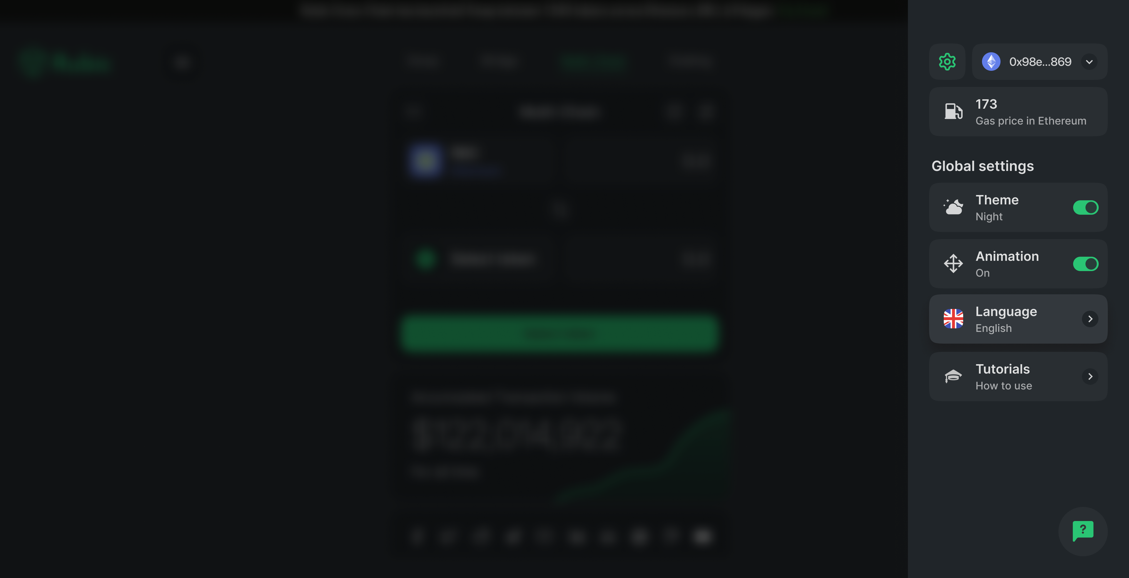
Палитра
Я усилил основной зеленый оттенок для лучшей визуальной привлекательности и подготовил сбалансированную палитру.
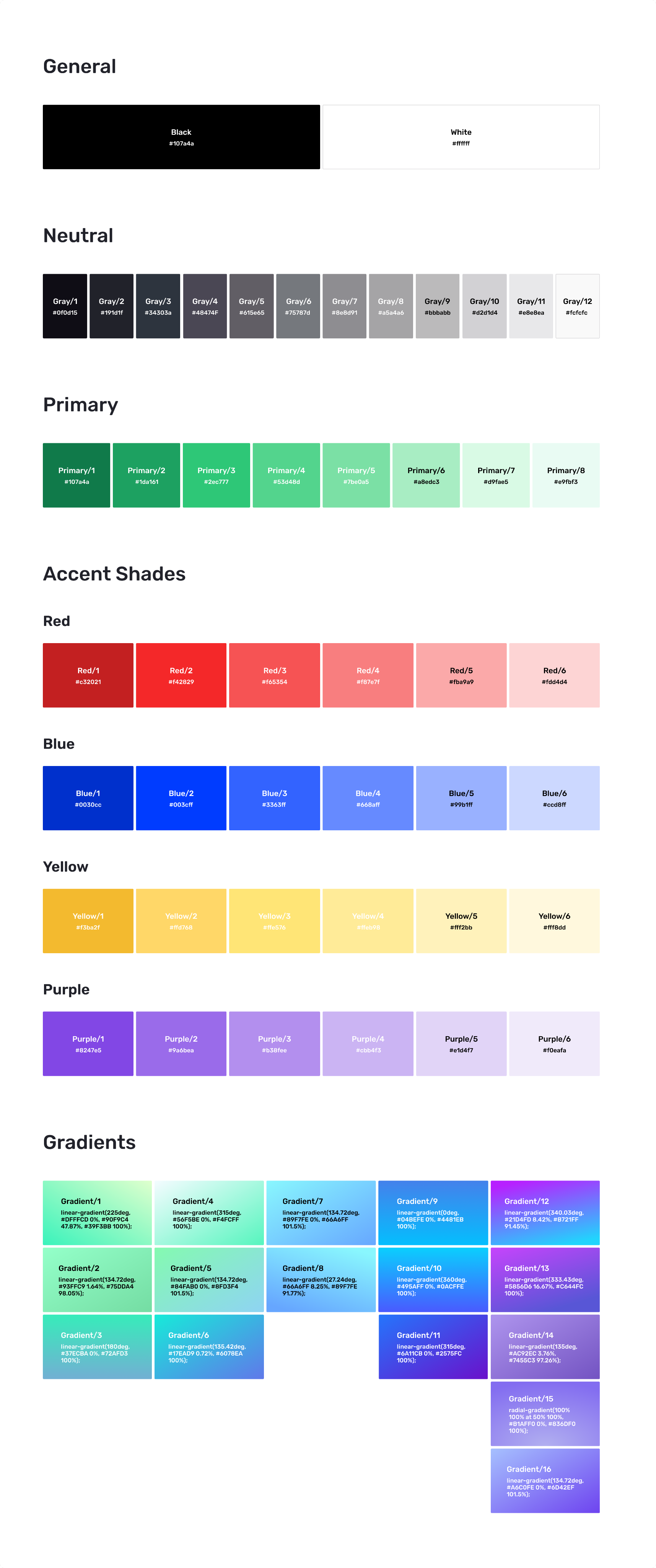
При этом было очень важно сохранить цветовую палитру как для светлой, так и для темной темы:
Типографика
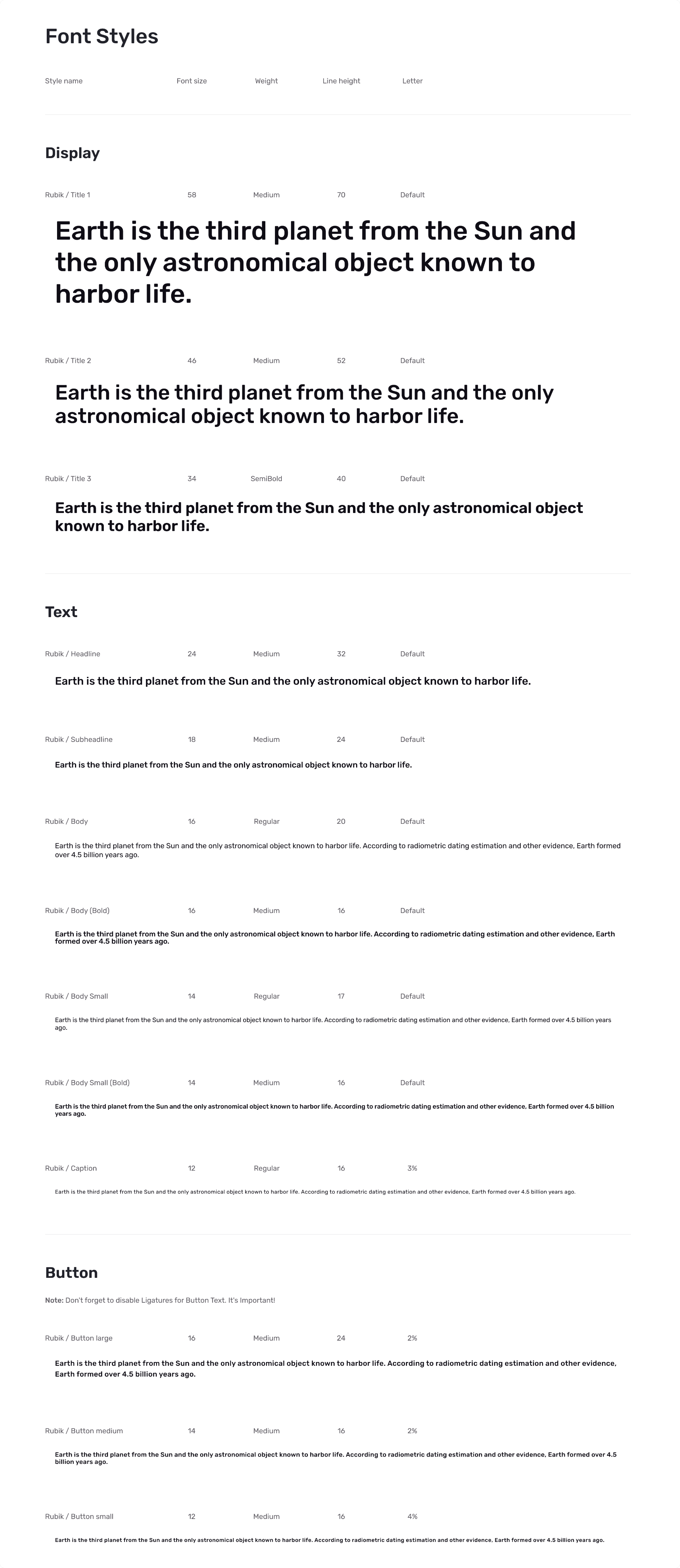
Был выбран новый шрифт, созвучный с названием сервиса, что придало ещё больше уверенности в выборе.
Также были выбраны начертания, которые будут использоваться в будущем.
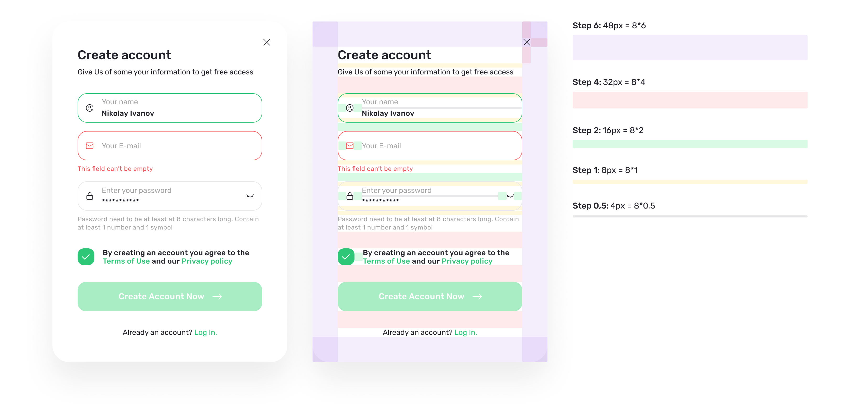
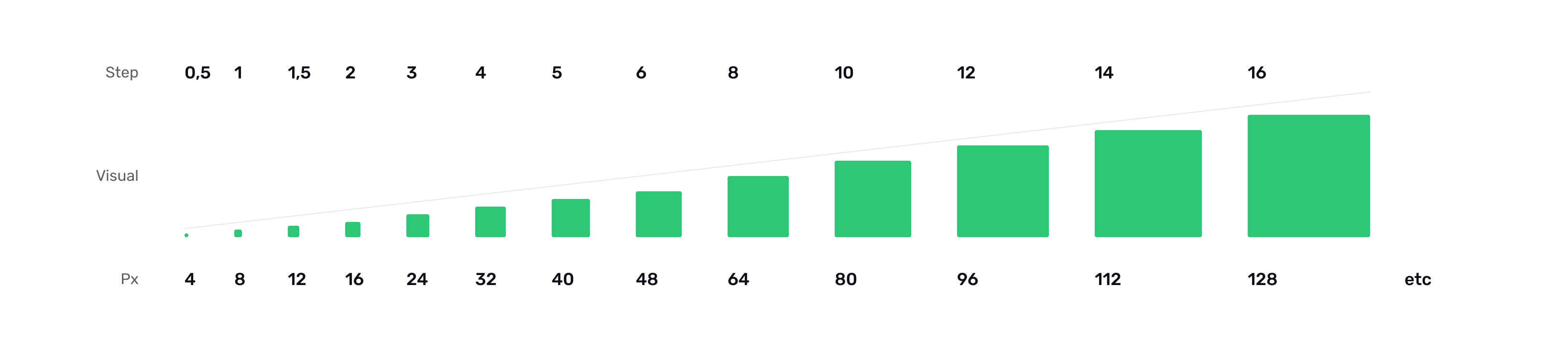
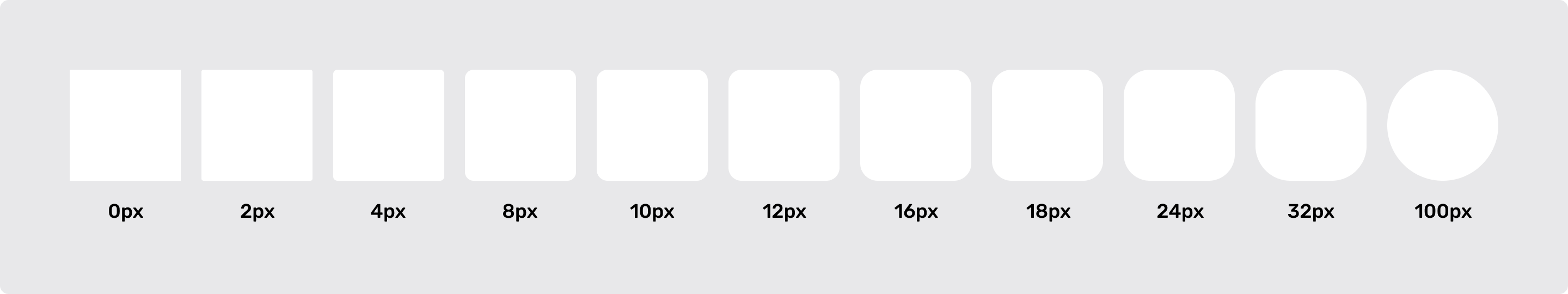
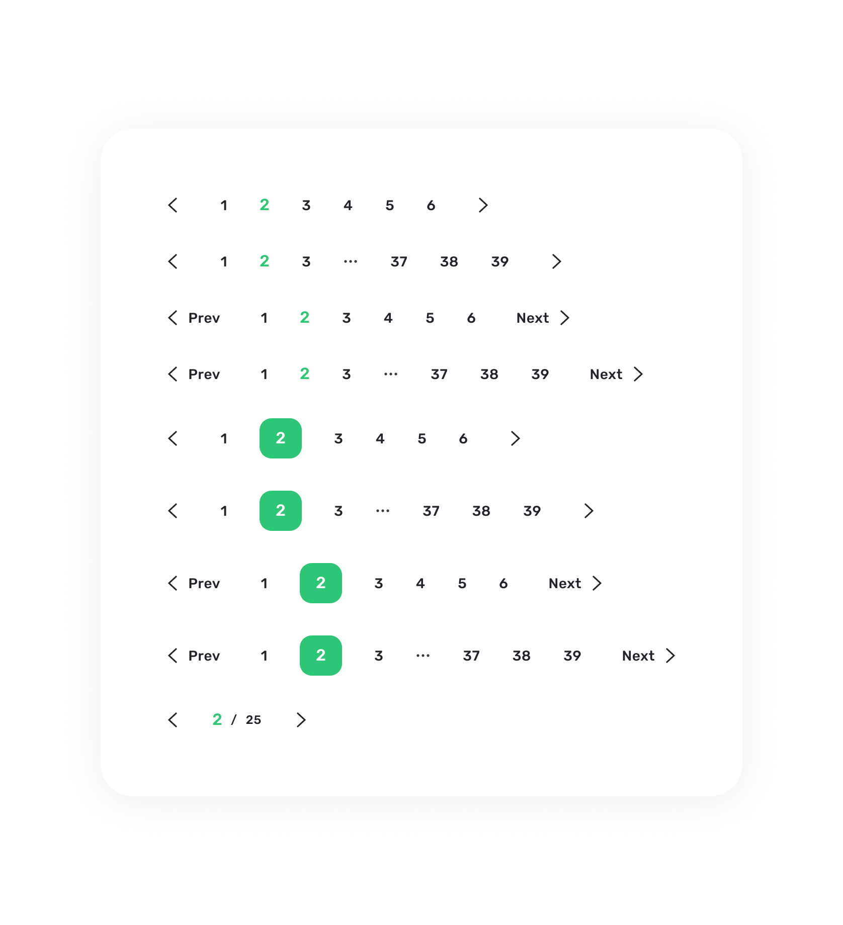
Система отступов
Наш первый эталонный отступ и шаг — 8 пикселей. Для построения корректной системы используется следующая градация:
Заметно, что градация, построенная на динамическом шаге, чёткая и сбалансированная. При этом сохраняется множественность значений.
Полученную градацию размеров остаётся использовать как готовую систему отступов
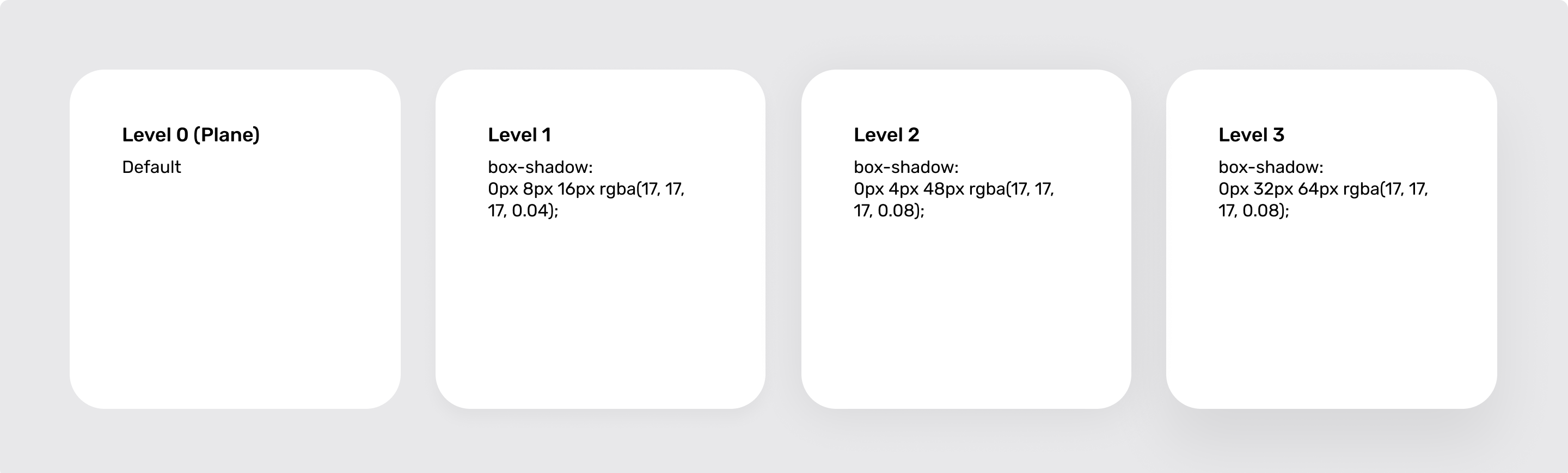
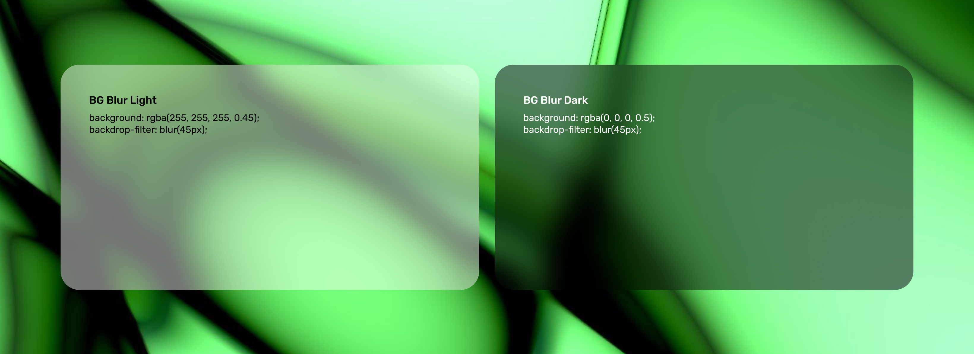
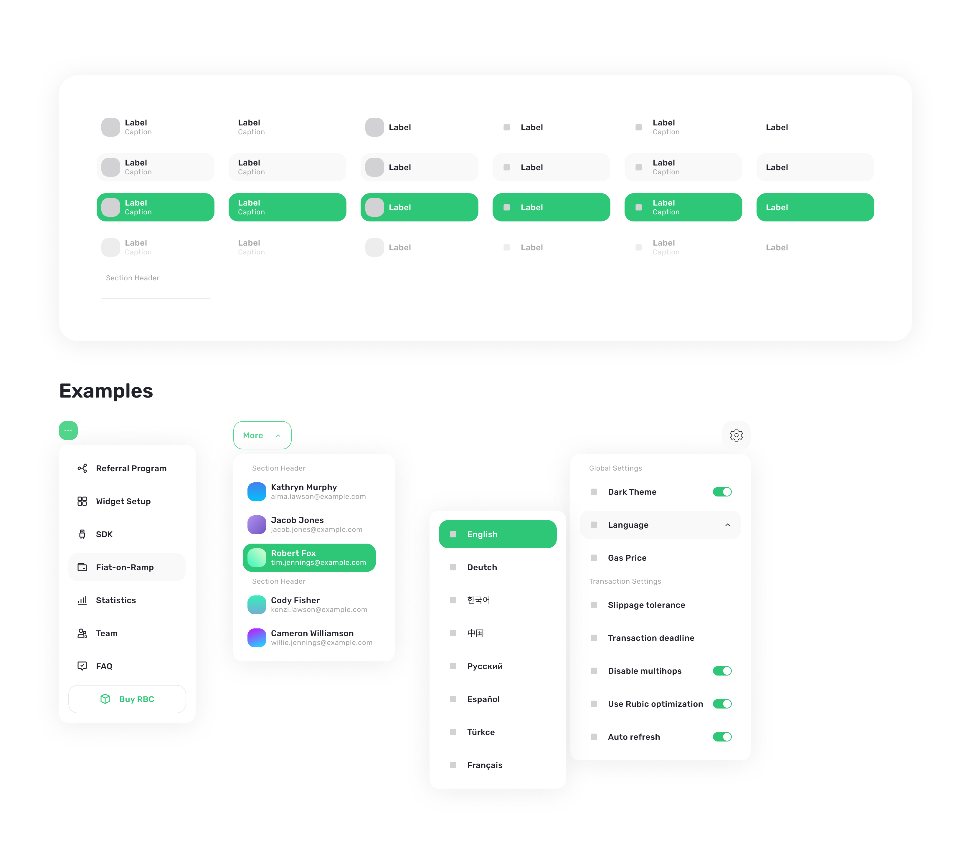
Стили объектов
Также были разработаны правила для высот, границ и размытия.
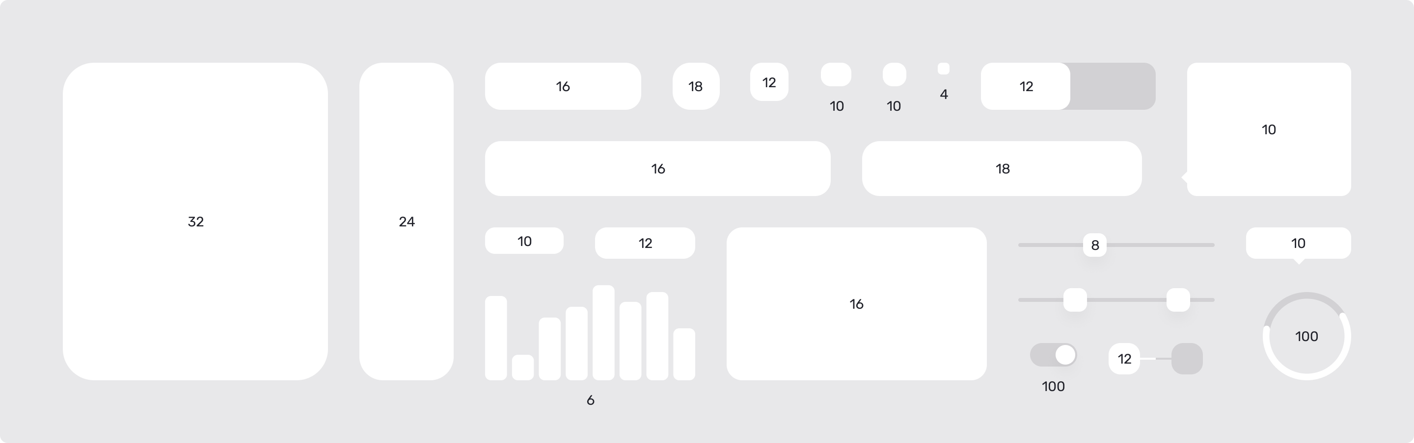
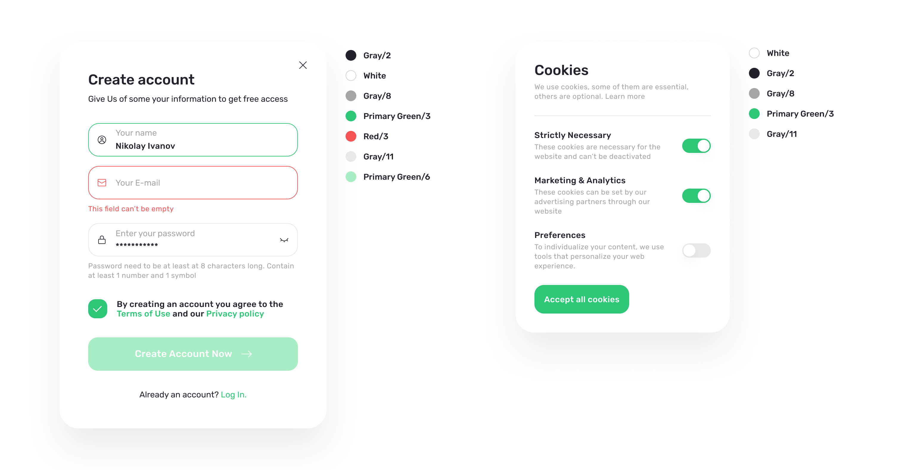
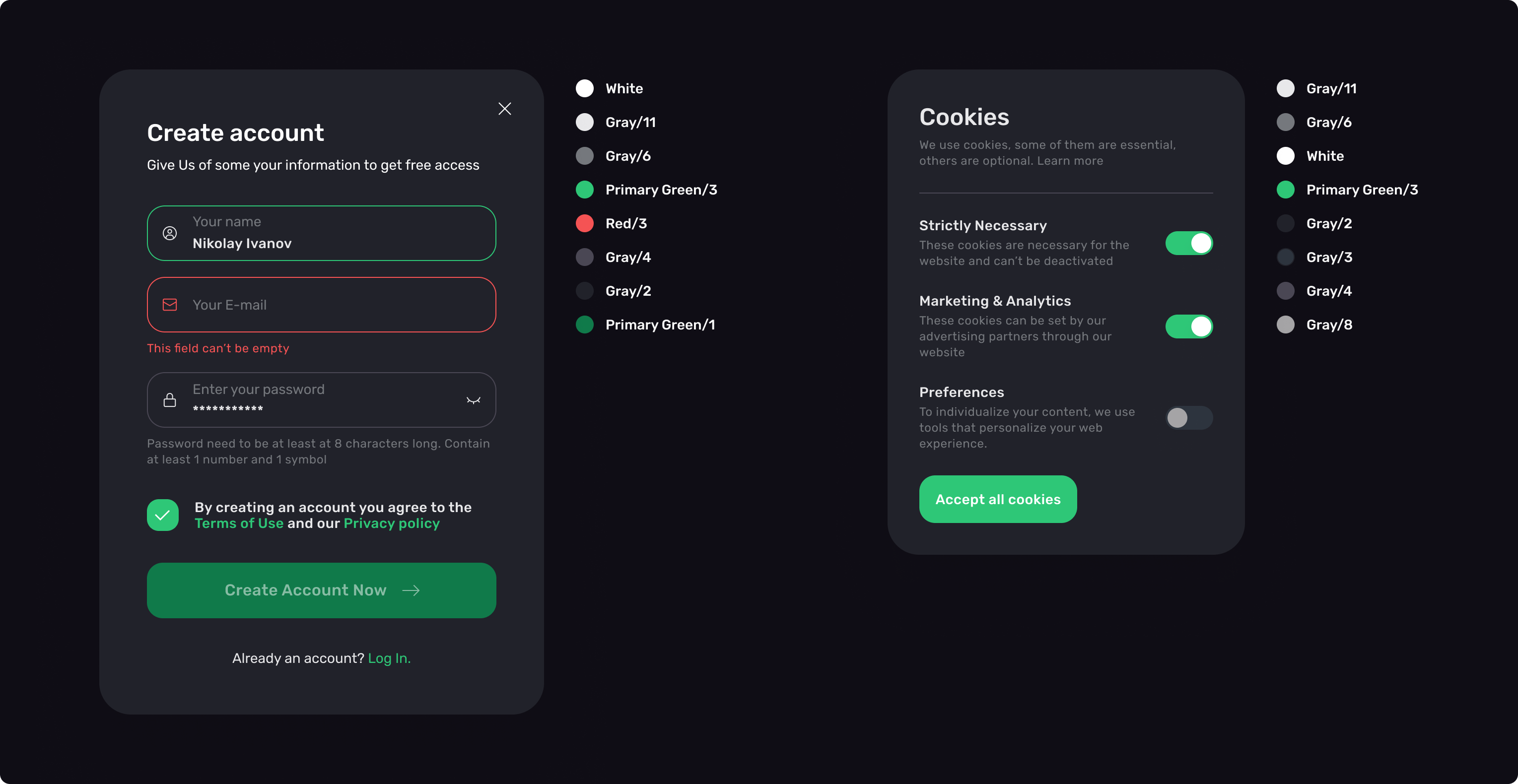
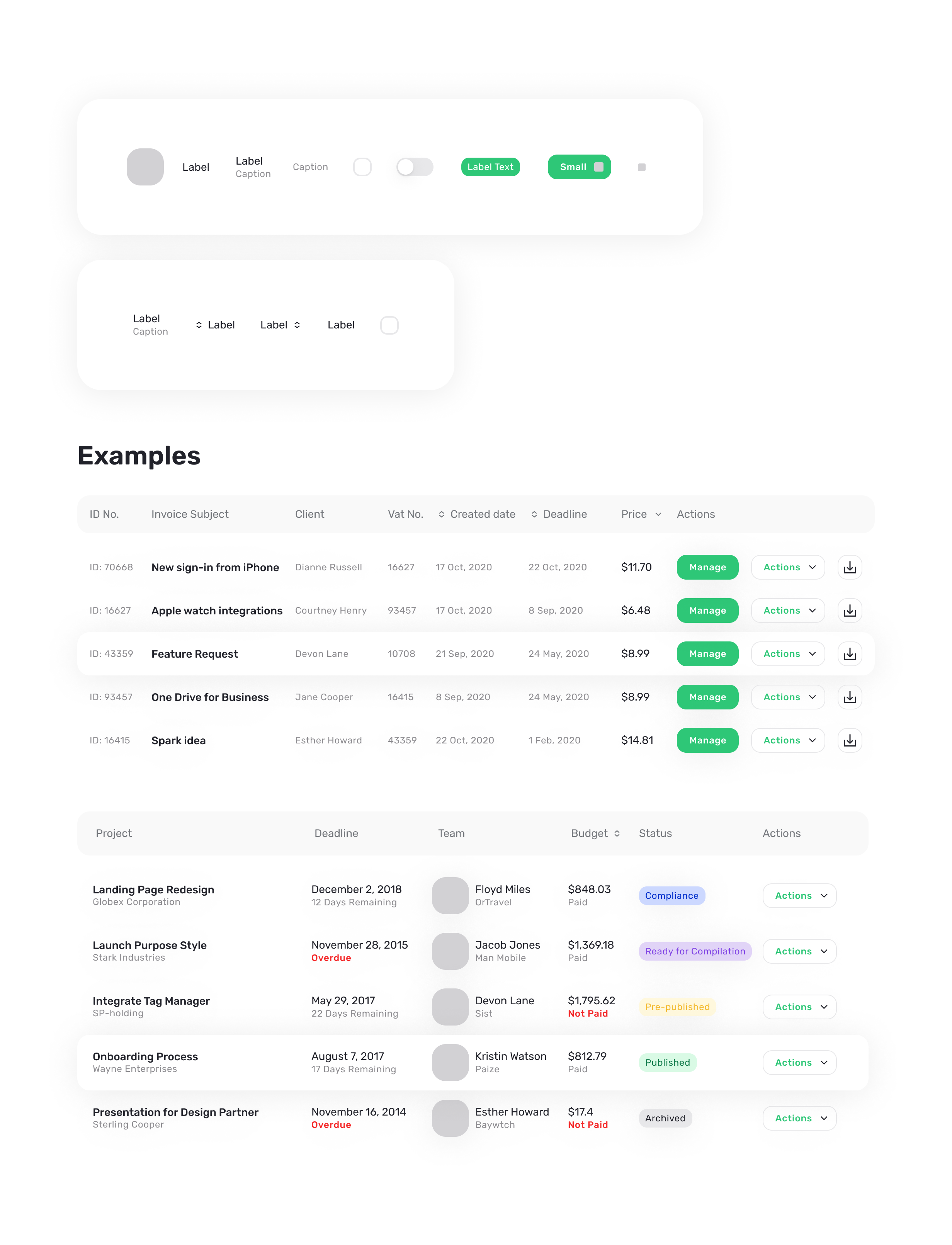
UI-кит
Более 2 000 объектов были разработаны в двух цветовых схемах
Редизайн
До редизайна приложение было нецелостным, с непоследовательными цветовыми решениями.
Пользователи часто сталкивались с юзабилити проблемами из-за перегруженности интерфейсов и не самой интуитивной навигации
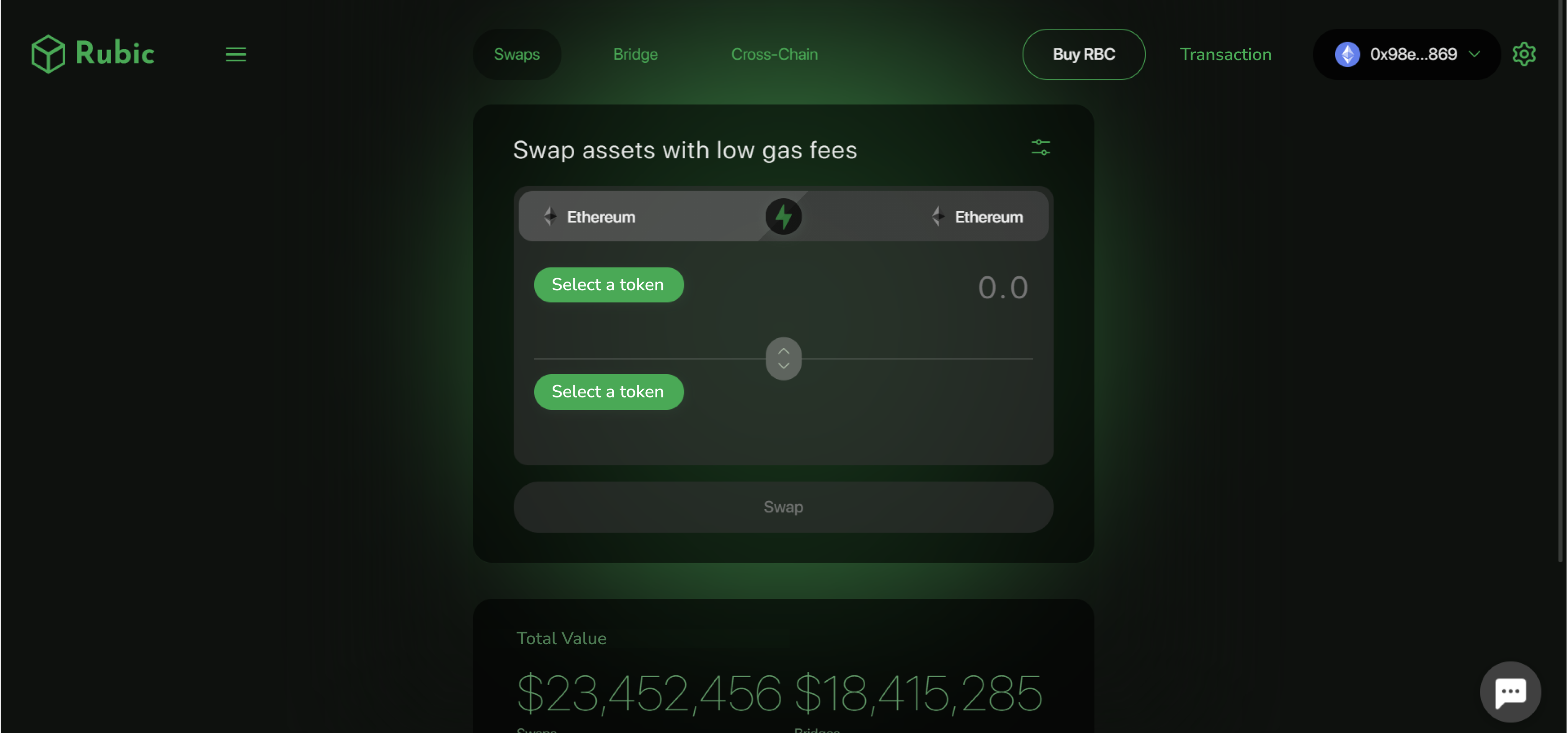
После редизайна приложение стало целостным и визуально привлекательным.
Цветовая палитра повысила читабельность и удобство использования, а продуманная типографика дала современный вид.
Оптимизирована навигация, что делает взаимодействие с приложением интуитивно понятным.
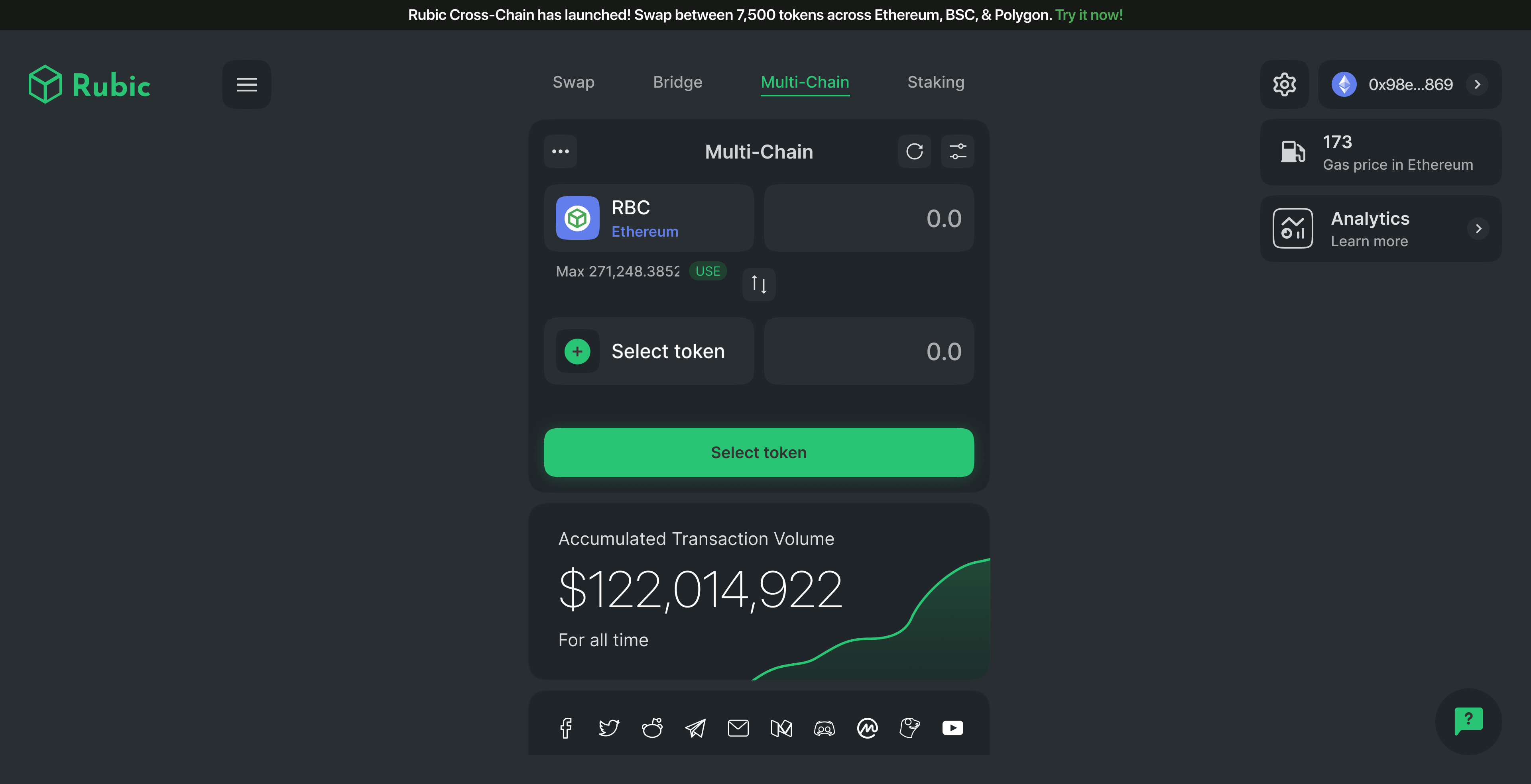
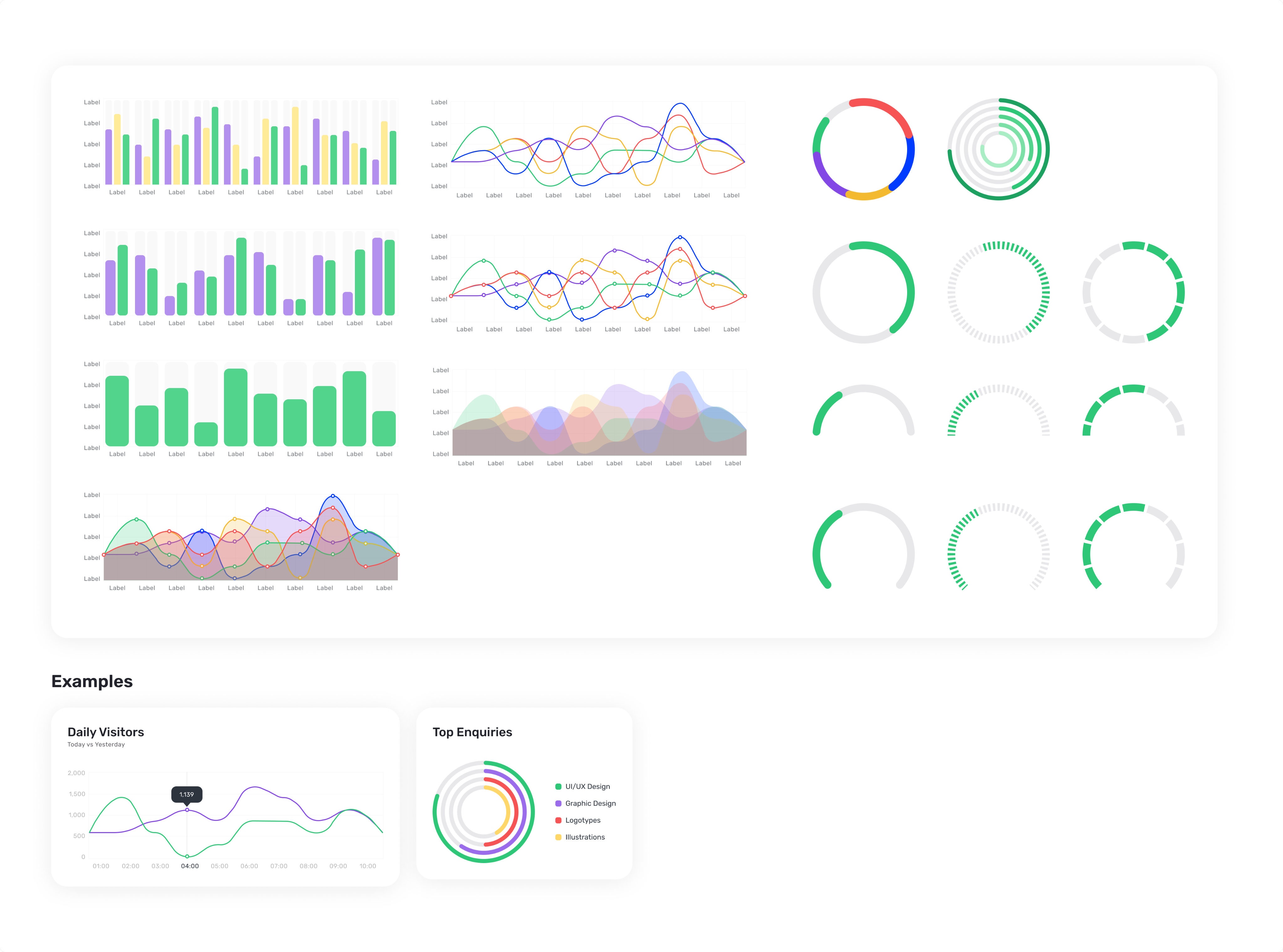
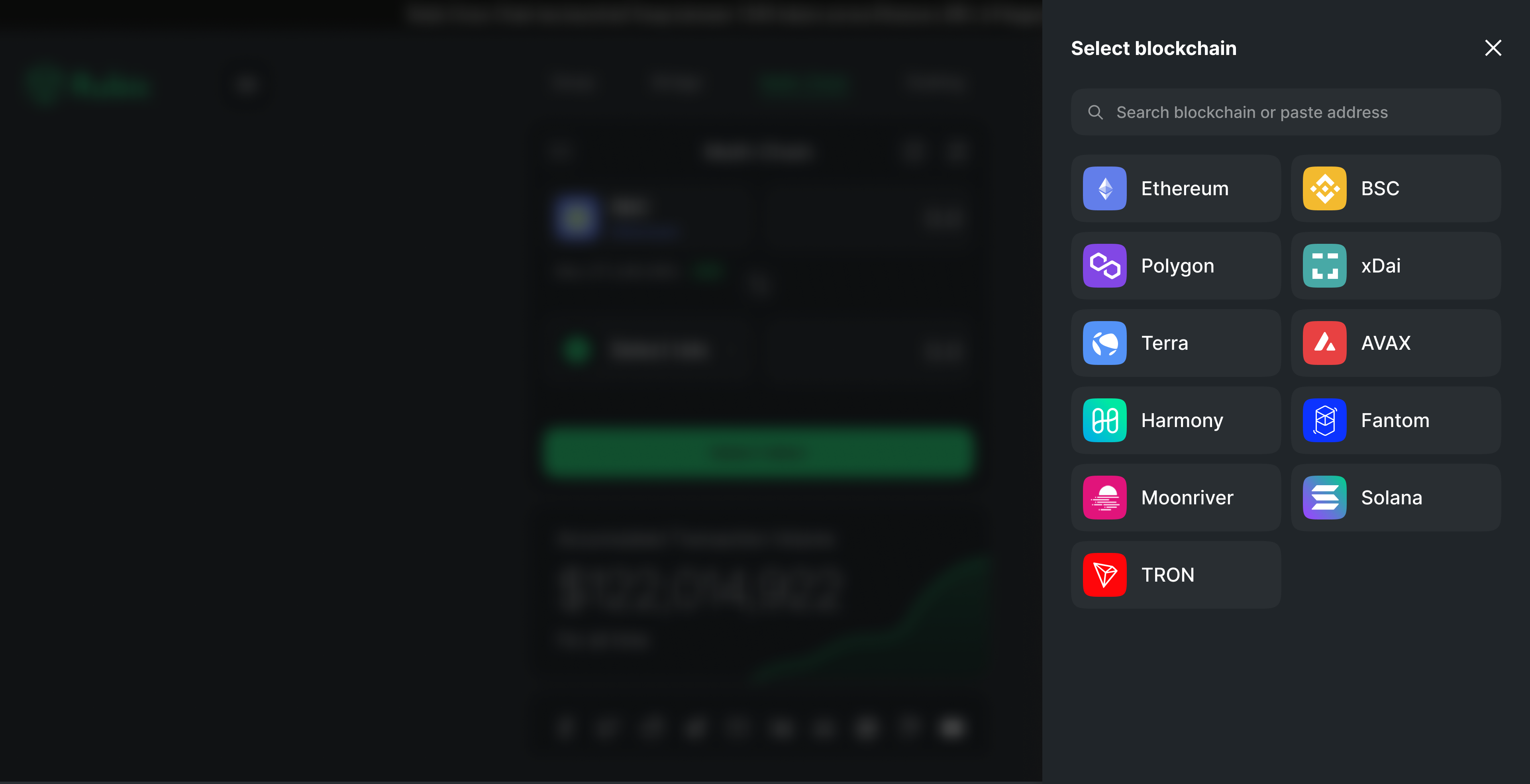
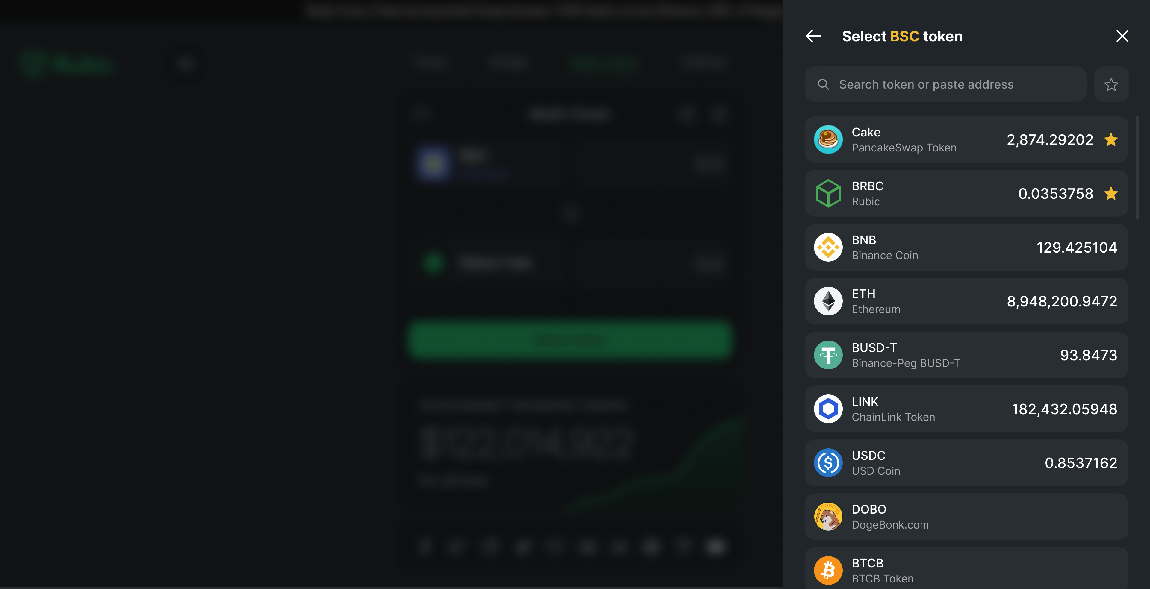
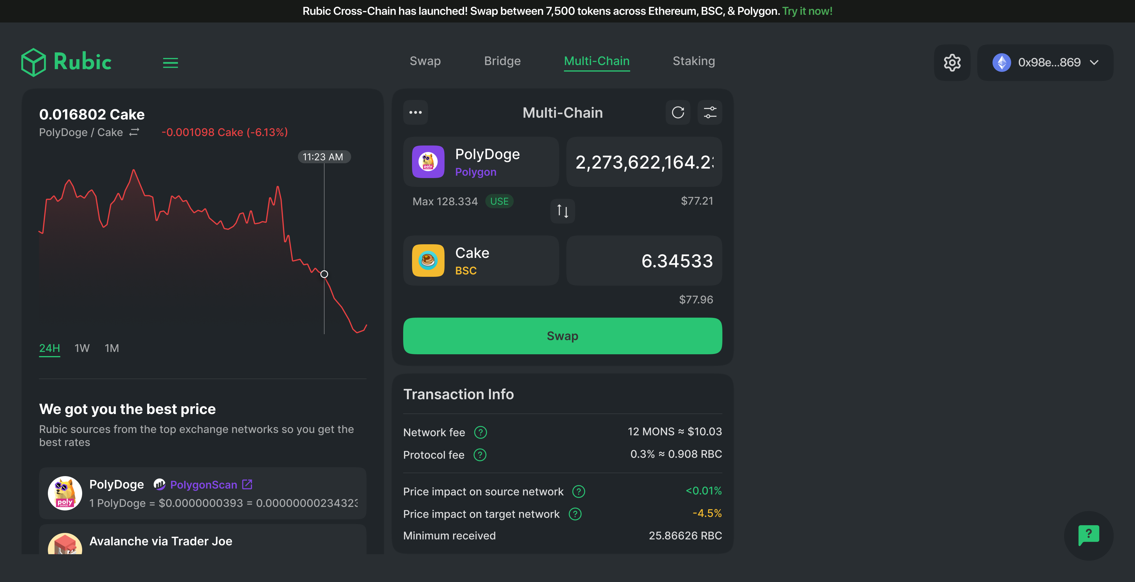
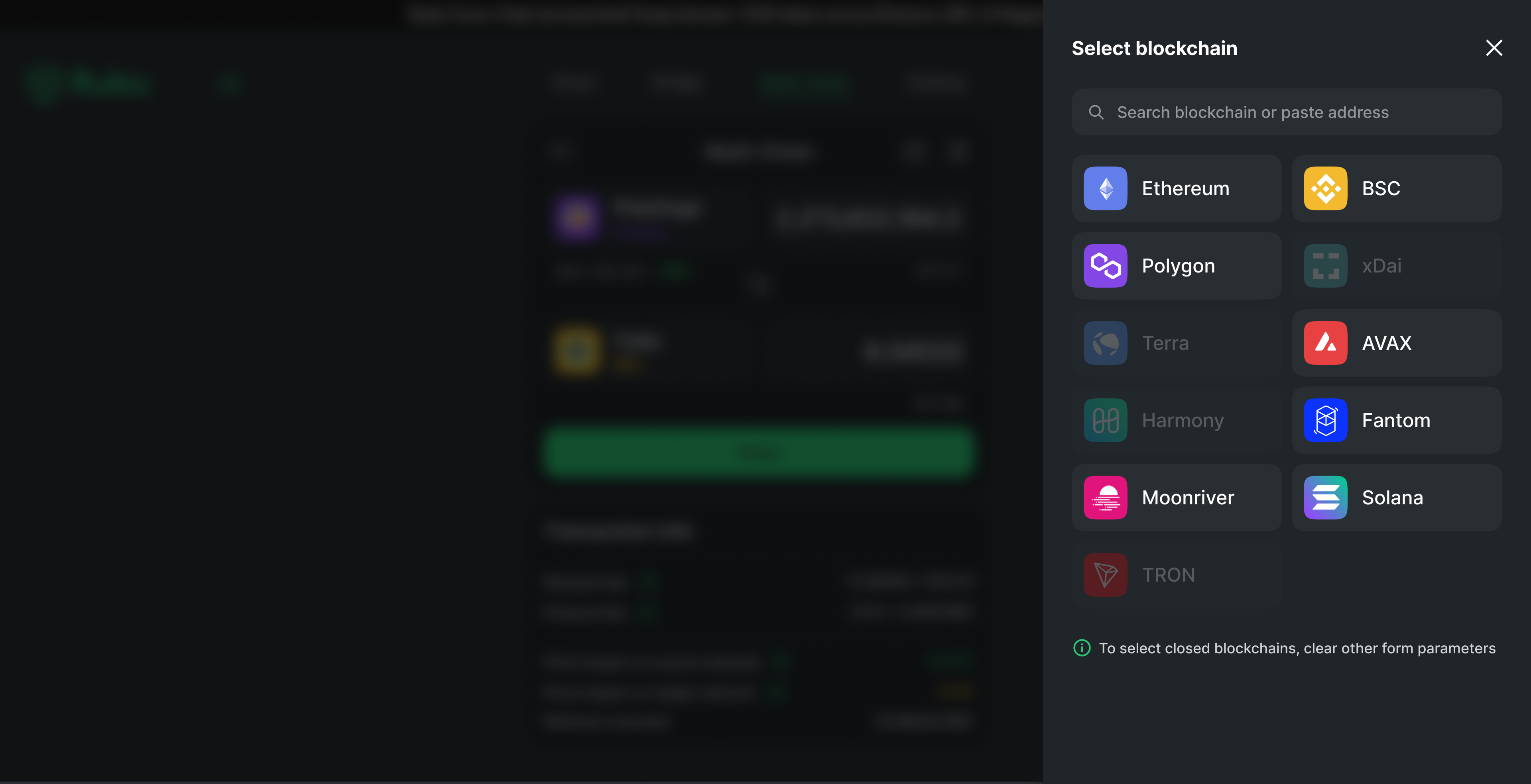
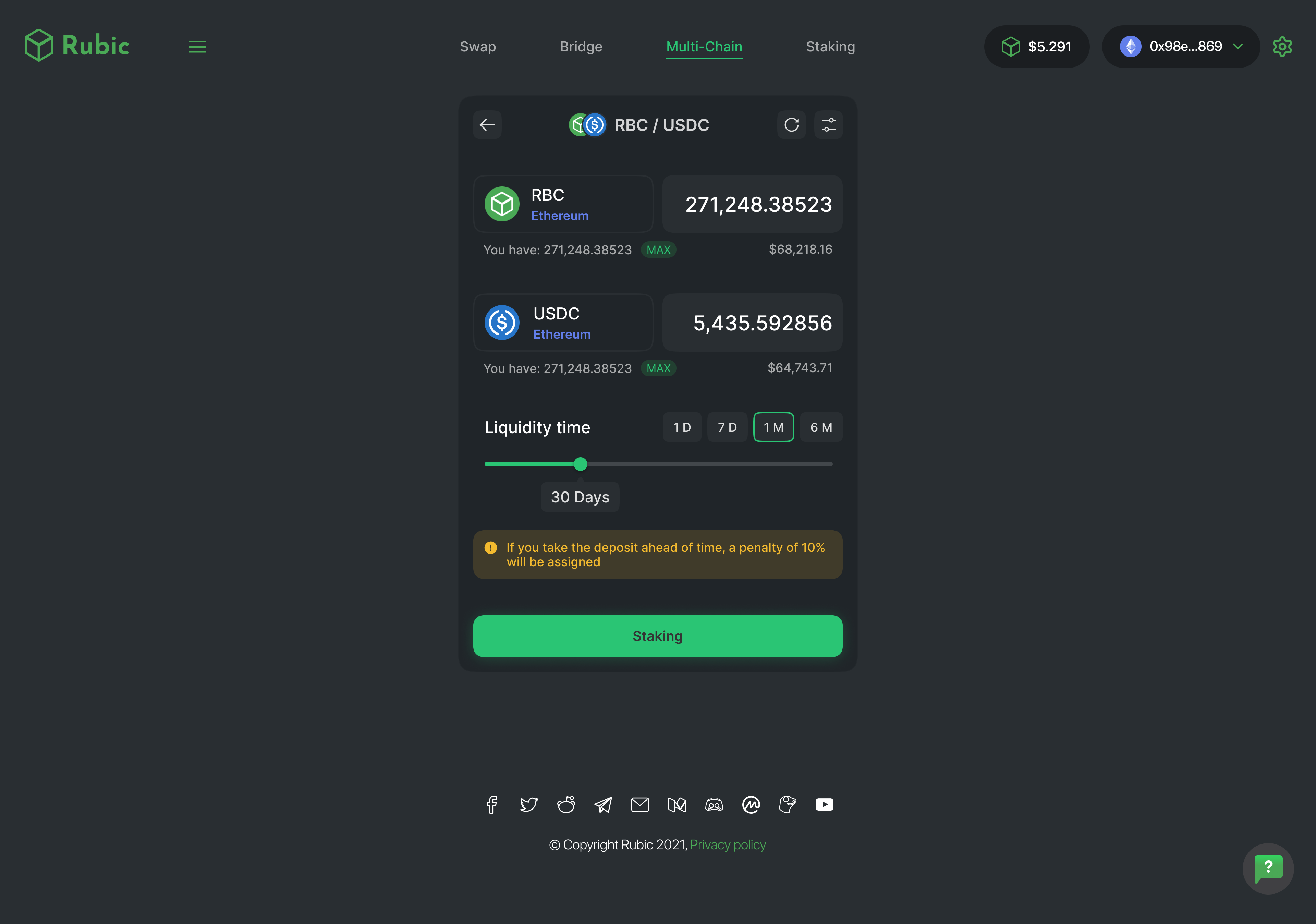
Multi-Chain
В обновлённом разделе multi-chain сделан упор на информативность и простоту.
Цветовая схема разработана специально для различных сетей, обеспечивая лёгкую идентификацию
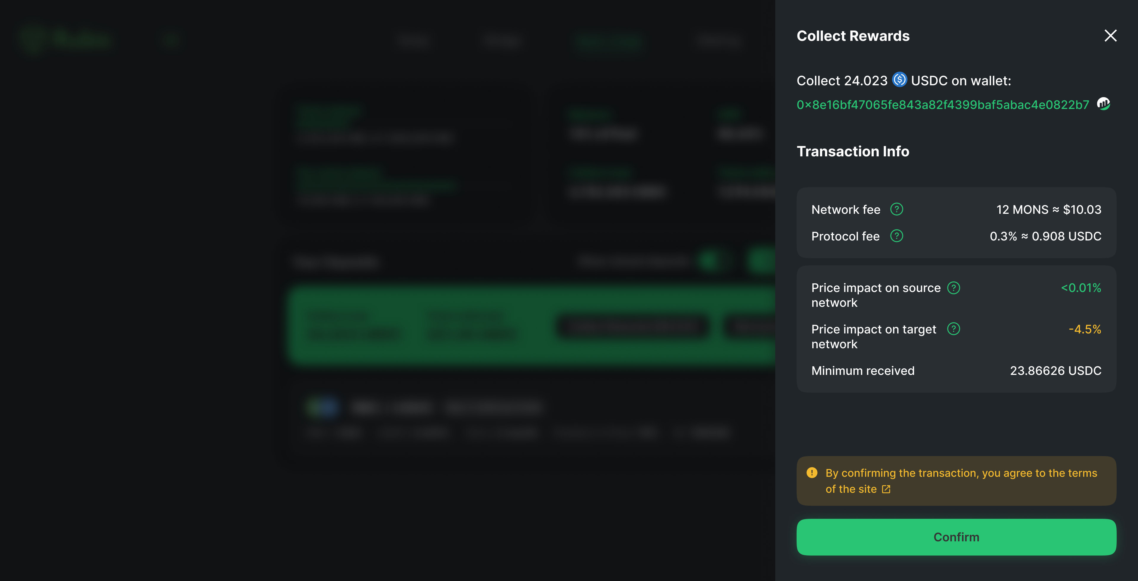
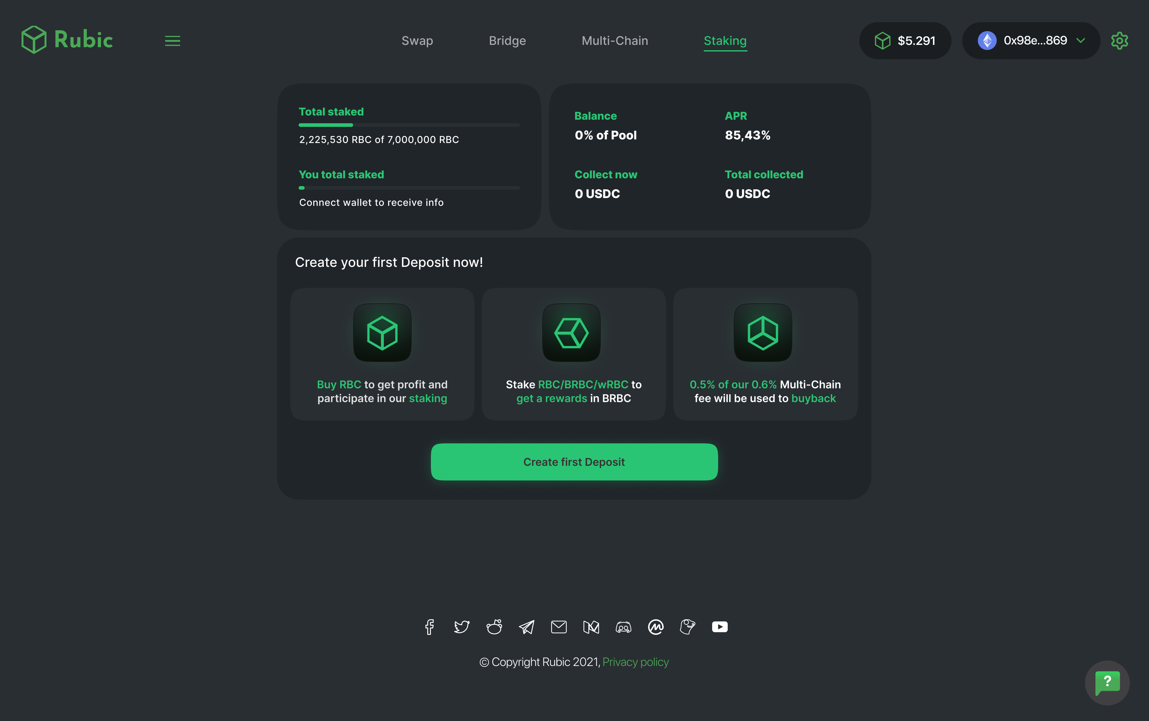
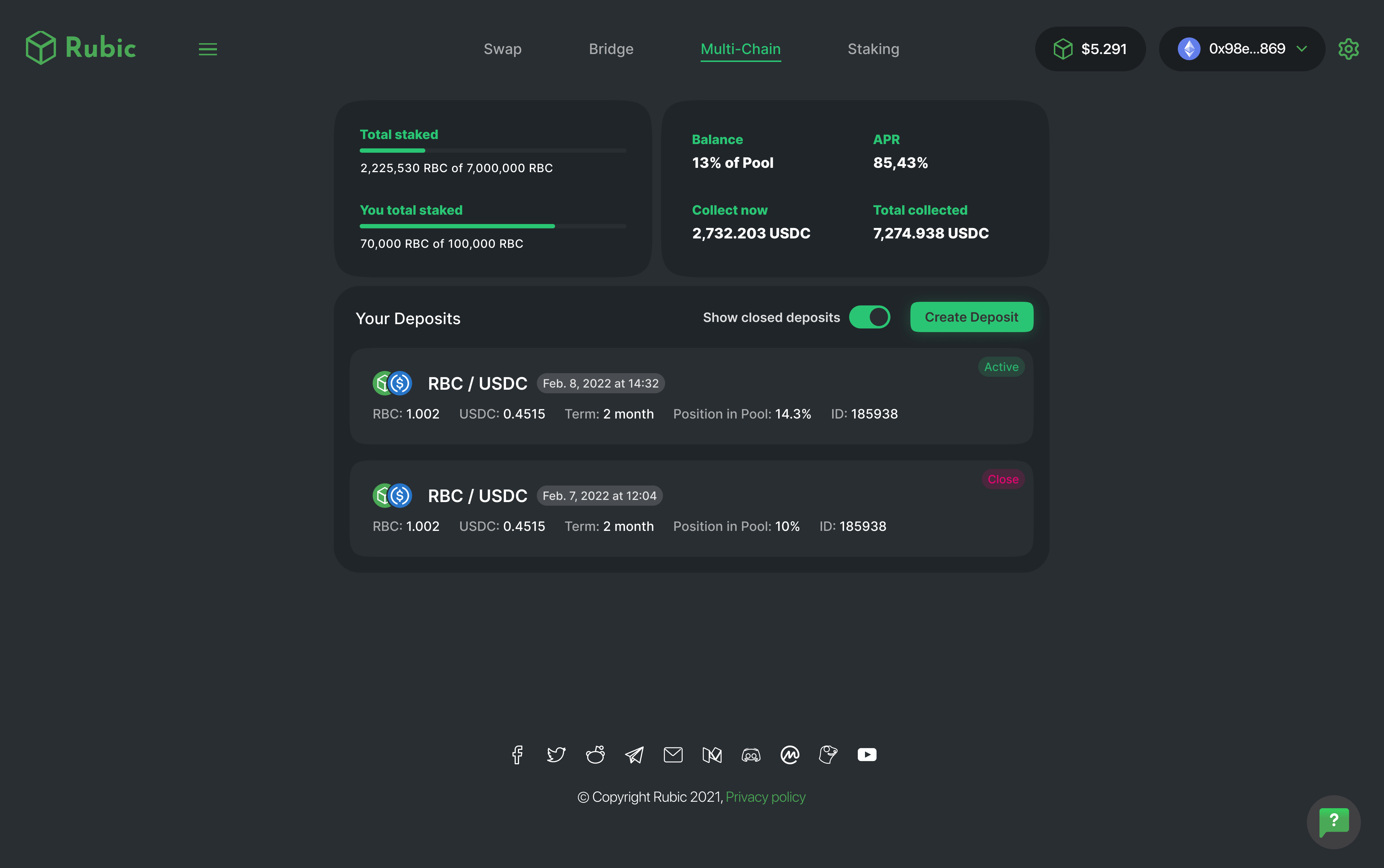
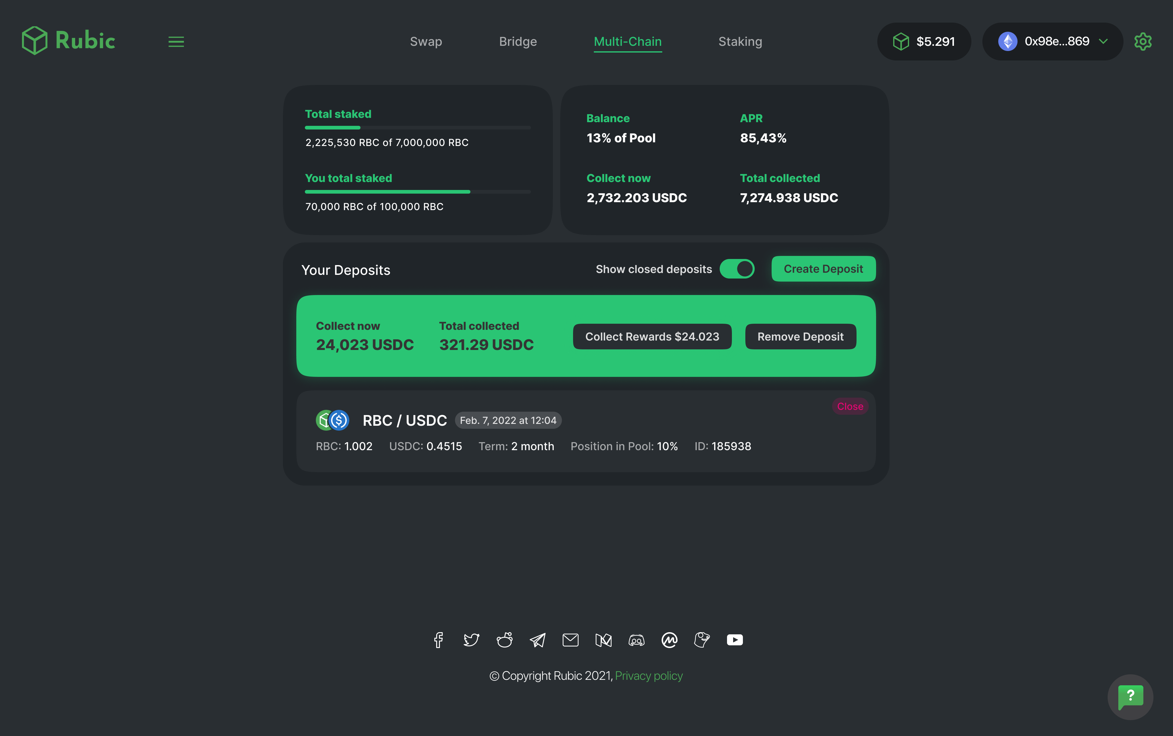
Staking
В обновлённом разделе, посвящённом стейкингу, приоритет отдаётся вовлеченности пользователей и прозрачности.
Визуальные элементы и интуитивно понятные интерфейсы помогают пользователям пройти процесс стейкинга, делая его понятным и простым для участия.
Контакты
@egorprotsenkoo
egrprotsenkoo@gmail.com
О проекте
Цели и задачи
Концепция
Веб-сервис
Палитра
Типографика
Система отступов
Стили объектов
UI-кит
Редизайн
Multi-Chain
Staking
Rubic
Ведущий UI/UX дизайнер
2021 – 2023
О проекте
Rubic — это инновационная DeFi-платформа для безопасной и удобной торговли криптовалютой.
Она обеспечивает быстрые и бесшовные транзакции, оставаясь одним из лидеров DeFi.
Цели и задачи
Проект был направлен на редизайн и улучшение интерфейса Rubic: анализ проблем, разработку решений, создание новой дизайн-системы, обновление фирменного стиля и адаптацию платформы под разные языки и культуры при сохранении единого визуального и функционального подхода.
Концепция
Дизайн Rubic основан на минимализме, интуитивной навигации и современном стиле.
Он сочетает чистый, функциональный интерфейс с сохранённой «гиковостью» и аккуратной строгостью, чтобы обеспечить удобство, визуальную лёгкость и профессиональный характер платформы.
Веб-серивс
Дизайн Rubic основан на минимализме, интуитивной навигации и современном стиле.
Он сочетает чистый, функциональный интерфейс с сохранённой «гиковостью» и аккуратной строгостью, чтобы обеспечить удобство, визуальную лёгкость и профессиональный характер платформы.
Роль
Ведущий UI/UX дизайнер
Задачи
Аудит и конкурентный анализ, сбор бизнес-требований, формирование гипотез и предложений по улучшению
Реализация
Был подготовлен аналитический отчёт с выявленными проблемами сервиса: проведена эвристическая оценка, построена карта пользовательских сценариев и выполнено юзабилити-тестирование.
На основе выводов и бизнес-требований создана дизайн-система и выполнен редизайн, внедрены новые функции и исправлены мелкие UI-недочёты, включая типографику и цветовые решения.
Палитра
Я усилил основной зеленый оттенок для лучшей визуальной привлекательности и подготовил сбалансированную палитру.
При этом было очень важно сохранить цветовую палитру как для светлой, так и для темной темы:
Типографика
Был выбран новый шрифт, созвучный с названием сервиса, что придало ещё больше уверенности в выборе.
Также были выбраны начертания, которые будут использоваться в будущем.
Система отступов
Наш первый эталонный отступ и шаг — 8 пикселей. Для построения корректной системы используется следующая градация:
Заметно, что градация, построенная на динамическом шаге, чёткая и сбалансированная. При этом сохраняется множественность значений.
Полученную градацию размеров остаётся использовать как готовую систему отступов
Стили объектов
Также были разработаны правила для высот, границ и размытия.
UI-кит
Более 2 000 объектов были разработаны в двух цветовых схемах
Редизайн
До редизайна приложение было нецелостным, с непоследовательными цветовыми решениями.
Пользователи часто сталкивались с юзабилити проблемами из-за перегруженности интерфейсов и не самой интуитивной навигации
После редизайна приложение стало целостным и визуально привлекательным.
Цветовая палитра повысила читабельность и удобство использования, а продуманная типографика дала современный вид.
Оптимизирована навигация, что делает взаимодействие с приложением интуитивно понятным.
Multi-Chain
В обновлённом разделе multi-chain сделан упор на информативность и простоту.
Цветовая схема разработана специально для различных сетей, обеспечивая лёгкую идентификацию
Staking
В обновлённом разделе, посвящённом стейкингу, приоритет отдаётся вовлеченности пользователей и прозрачности.
Визуальные элементы и интуитивно понятные интерфейсы помогают пользователям пройти процесс стейкинга, делая его понятным и простым для участия.
Контакты
@egorprotsenkoo
egrprotsenkoo@gmail.com
Назад
О проекте
Цели и задачи
Концепция
Веб-сервис
Палитра
Типографика
Система отступов
Стили объектов
UI-кит
Редизайн
Multi-Chain
Staking
Rubic
Ведущий UI/UX дизайнер
2021 – 2023
О проекте
Rubic — это инновационная DeFi-платформа для безопасной и удобной торговли криптовалютой.
Она обеспечивает быстрые и бесшовные транзакции, оставаясь одним из лидеров DeFi.
Цели и задачи
Проект был направлен на редизайн и улучшение интерфейса Rubic: анализ проблем, разработку решений, создание новой дизайн-системы, обновление фирменного стиля и адаптацию платформы под разные языки и культуры при сохранении единого визуального и функционального подхода.
Концепция
Дизайн Rubic основан на минимализме, интуитивной навигации и современном стиле.
Он сочетает чистый, функциональный интерфейс с сохранённой «гиковостью» и аккуратной строгостью, чтобы обеспечить удобство, визуальную лёгкость и профессиональный характер платформы.
Веб-серивс
Дизайн Rubic основан на минимализме, интуитивной навигации и современном стиле.
Он сочетает чистый, функциональный интерфейс с сохранённой «гиковостью» и аккуратной строгостью, чтобы обеспечить удобство, визуальную лёгкость и профессиональный характер платформы.
Роль
Ведущий UI/UX дизайнер
Задачи
Аудит и конкурентный анализ, сбор бизнес-требований, формирование гипотез и предложений по улучшению
Реализация
Был подготовлен аналитический отчёт с выявленными проблемами сервиса: проведена эвристическая оценка, построена карта пользовательских сценариев и выполнено юзабилити-тестирование.
На основе выводов и бизнес-требований создана дизайн-система и выполнен редизайн, внедрены новые функции и исправлены мелкие UI-недочёты, включая типографику и цветовые решения.
Палитра
Я усилил основной зеленый оттенок для лучшей визуальной привлекательности и подготовил сбалансированную палитру.
При этом было очень важно сохранить цветовую палитру как для светлой, так и для темной темы:
Типографика
Был выбран новый шрифт, созвучный с названием сервиса, что придало ещё больше уверенности в выборе.
Также были выбраны начертания, которые будут использоваться в будущем.
Система отступов
Наш первый эталонный отступ и шаг — 8 пикселей. Для построения корректной системы используется следующая градация:
Заметно, что градация, построенная на динамическом шаге, чёткая и сбалансированная. При этом сохраняется множественность значений.
Полученную градацию размеров остаётся использовать как готовую систему отступов
Стили объектов
Также были разработаны правила для высот, границ и размытия.
UI-кит
Более 2 000 объектов были разработаны в двух цветовых схемах
Редизайн
До редизайна приложение было нецелостным, с непоследовательными цветовыми решениями.
Пользователи часто сталкивались с юзабилити проблемами из-за перегруженности интерфейсов и не самой интуитивной навигации
После редизайна приложение стало целостным и визуально привлекательным.
Цветовая палитра повысила читабельность и удобство использования, а продуманная типографика дала современный вид.
Оптимизирована навигация, что делает взаимодействие с приложением интуитивно понятным.
Multi-Chain
В обновлённом разделе multi-chain сделан упор на информативность и простоту.
Цветовая схема разработана специально для различных сетей, обеспечивая лёгкую идентификацию
Staking
В обновлённом разделе, посвящённом стейкингу, приоритет отдаётся вовлеченности пользователей и прозрачности.
Визуальные элементы и интуитивно понятные интерфейсы помогают пользователям пройти процесс стейкинга, делая его понятным и простым для участия.
Контакты
@egorprotsenkoo
egrprotsenkoo@gmail.com
Москва, Россия — Всё вокруг вас создано человеком.